Introduction
Using Chart Advisor
Introduction
Have you ever wondered if the typical column chart you use all the time is the best way to present your data? Or should you explore the other
variations for column charts? Maybe, you should use a stacked area chart to show some data in a better way? There are so many questions -- and
answers to most of them would be on the lines of "Great, but first I need to see what these charts look like with my data!" That's a
perfectly valid reasoning -- and our review product can be just what you need -- unfortunately, it has two big disadvantages that we will explore
soon after we introduce you to the product!
Chart Advisor is a free plug-in from Microsoft Office Labs for Excel 2007 that helps you to
quickly choose the perfect chart type for your data. The two disadvantages we want you to be aware of are:
- Chart Advisor only works within Excel 2007 -- but that's not a huge issue since you can always copy the chart created in Excel to your PowerPoint
slide.
- Chart Advisor does not install if you use Office 2010 (rather than the older Office 2007) -- this is a bigger disadvantage. But we like this
product so much that we created a virtual machine that has only Office 2007 installed -- sometimes it is worth the trouble because Chart Advisor can
be a great chart brainstorming tool!
Let's now explore what Chart Advisor actually does! First of all, go and download Chart Advisor from the Microsoft Office Labs site --
thereafter you may want to look at this video clip on YouTube.com:
Back
Using Chart Advisor
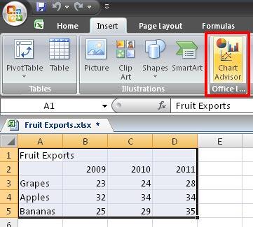
Once you install the Chart Advisor, you will find it as a single button within the Insert tab of the
Ribbon in Excel 2007 (highlighted in red in
Figure 1 below). Follow these steps to learn how to use it:
- Select your spreadsheet data which you want to present in a chart. Then access the Insert tab of the
Ribbon - within this tab, click the Chart Advisor button that you can
see highlighted in red in Figure 1.

Figure 1: Chart Advisor button
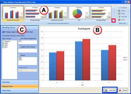
- This will open the Chart Advisor from Microsoft Office Labs interface that you can see in Figure 2.

Figure 2: Chart Advisor from Microsoft Office Labs interface
This interface includes three main sections explained below (as marked above in Figure 2):
- Chart Advisor Recommendations: This section includes the array of different types of charts created using the spreadsheet data
you selected. Chart Advisor ranks each chart in percentage based on it's suitability to your selected spreadsheet data. If you want to view all
charts available, click the down-arrow in this section (highlighted in red in Figure 2 above).
Just hover the cursor over any of the charts within the Chart Advisor Recommendations gallery to see a
Live Preview within the Chart Preview section. To apply a
chart, just click on the selected chart thumbnail.
- Chart Preview: In this section, you can see the preview of the chart which you have selected in the
Chart Advisor Recommendations section.
- Modify Chart: This section provides you with the options that let you make changes to the chart you have selected. When you make
any changes in this section, a dialog box will pop up that you can see in Figure 3.

Figure 3: Dialog box to update the chart with changes made
To retain any changes you made to the selected chart, click the Update Chart button within the dialog box (refer to
Figure 3 above), otherwise click the Undo Changes button to go back to the
Chart Advisor from Microsoft Office Labs interface.
- Once done, click the Insert Chart button (highlighted in blue in Figure 2 above).
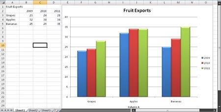
This will insert the selected chart within your Excel sheet as shown in Figure 4.

Figure 4: Chart created within Chart Advisor
After the chart is inserted, you can move or resize it as required. Also you can copy your chart and paste it within your PowerPoint slide. Do
note that simple copy-pasting from Excel to PowerPoint will work the best since PowerPoint will now allow you to recolor the chart -- or even animate
it as required. Look at our PowerPoint charting tutorials to learn more.
Back
