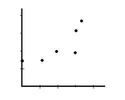
Learn about XY (Scatter) charts, and how you can use them within PowerPoint. These charts can have numbered values on both axes.
Author: Geetesh Bajaj
Product/Version: PowerPoint
OS: Microsoft Windows and Mac OS X
Scatter charts show the relationship among numeric values in several data series, or plot two groups of numbers as one series of XY coordinates. A scatter chart has two value axes, showing one set of numeric data along the horizontal axis (X-axis) and another along the vertical axis (Y-axis). It combines these values into single data points and displays them in irregular intervals, or clusters. Scatter charts are typically used for displaying and comparing numeric values, such as scientific, statistical, and engineering data.

Consider using scatter charts in the following cases:
Scroll down to the bottom of the page to see a sample presentation containing scatter chart types and subtypes:
Scatter charts always use values on both axes and cannot use textual names on the X axis. If you want a chart that uses names on the X-axis, but looks like an XY Scatter chart, you can create a line chart.
Scatter charts have the following subtypes:
This type of chart compares pairs of values. You can use this chart type when you do not have to show the connectivity of data points.
This type of chart displays a smooth curve that connects the data points. Use a smooth line without markers if there are many data points.
With this chart type, the scatter chart can be displayed with smooth lines and markers.
This type of chart displays straight connecting lines between data points.
Here straight lines can be displayed with markers.
Click below to view on SlideShare
Click below to view on YouTube
10 13 07 - PowerPoint Chart Types: XY (Scatter) Charts in PowerPoint (Glossary Page)
You May Also Like: Explore Fonts: Baskerville Old Face | Burger PowerPoint Templates


Microsoft and the Office logo are trademarks or registered trademarks of Microsoft Corporation in the United States and/or other countries.