< Continued from Page 5
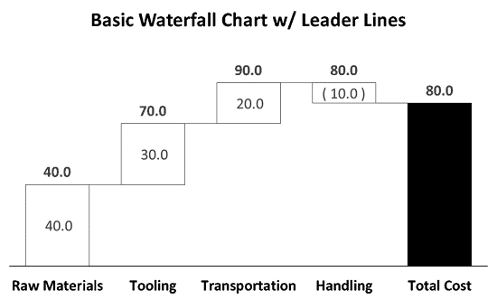
Another common feature of Waterfall charts is leader lines, or step lines, that connect each value within the Chart (as you can see below in Figure 1). These can easily be added to any Waterfall chart by overlaying a second level of data into the chart.
For this example, I will continue with the same data points and Waterfall chart.

Figure 1: Basic Waterfall Chart with Leader Lines
- Setting Up Leader Lines: To add leader lines, first return to the Excel spreadsheet behind the chart, by right-clicking the chart and selecting the Edit Data in Excel option.
- You will then need to add additional columns for the leader lines into the chart area to overlay on top of the chart.
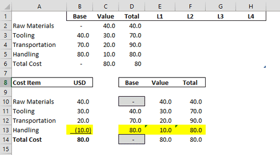
- As a hard rule, you always need one less leader line that you have rows of information in your chart. Since I currently have five rows of information in the Chart, I will then need to add four columns of data to my plot area, for a total of four leader lines. I will simply label them L1, L2, L3, and L4 across the top of the Excel sheet within the plot area (see Figure 2, below).

Figure 2: Setting Up the Leader Lines Note: If your chart plot area doesn’t automatically adjust, drag the little plot area icon, the little blue arrow, to cell H6.
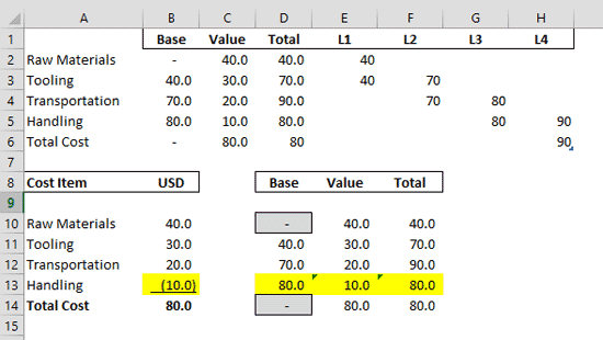
- Filling in the Leader Line Data: To set up the leader lines, you need to hard code each leader line to start at the Total for that category and continue on one cell below. So two data points for each leader line.
- So for example, L1 will start at 40 (the Total for Raw Materials) in cell E2 and end at 40 continue on at the same value, 40 into cell E3. L2 will start at 70 (the Total for Tooling) in F3 and continue on at the same value, 70 into F4, and so on.
- Simply hard-code the values in for each leader line, which should create a step like process across your plot area, as shown in Figure 3, below.

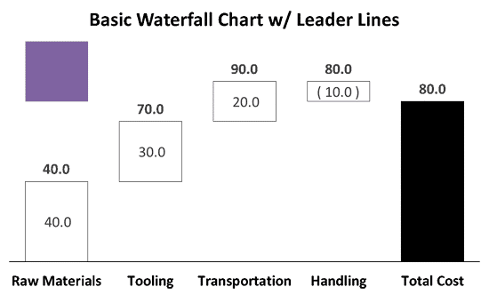
Figure 3: Hardcode the values - Returning to PowerPoint: With the leader lines set, hit Ctrl + W on your keyboard to close the Excel spreadsheet and return to PowerPoint, where you will only be able to see one of the new columns (purple in my chart).

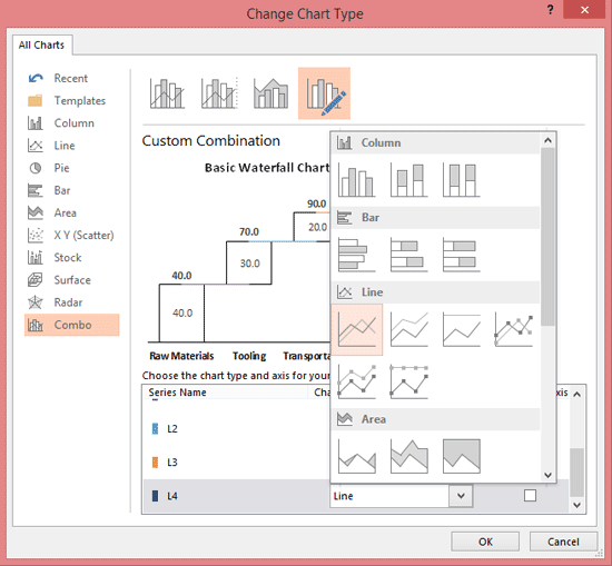
Figure 4: Returning to PowerPoint - Changing the Chart Type for the Leader Lines: Right-click a data point in the chart and in the right-click menu select the Change Series Chart Type option to launch the Change Chart Type dialog box.
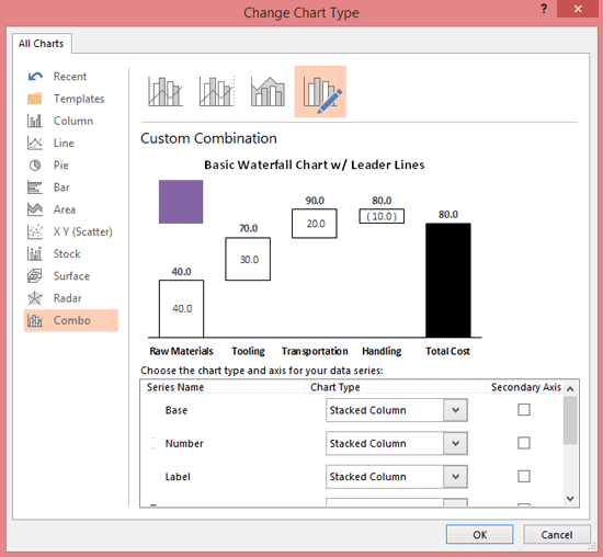
- Here in PowerPoint 2013 for Windows, you should be taken to the new Combo Chart Type. Within the Change Chart Type dialog box you simply want to scroll down and for L1 through L4, change the chart type to a line, which adds colored lines to your chart in the preview window. Then close the Change Chart Type dialog box.

Figure 5: Change Chart Type Dialog Box 
Figure 6: Changing the Chart Types - Formatting your Lines: From here you can format your lines to fit into your graphic. I typically change the outline color and width to match the column charts, so black outline color and ½pt outline weight. You can also change the lines into solid lines if you like.

Figure 7: Pre-Formatted Lines 
Figure 8: Basic Waterfall Chart with Leader Lines
Ending Excel Spreadsheet Formulas for your Negative Waterfall chart with Leader Lines
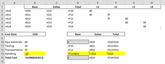
Just as a reference, below is what the formulas inside the Excel spreadsheet of your negative Waterfall chart look like.

Figure 9: Formulas inside the Excel spreadsheet of your negative Waterfall chart
