There are three types of text containers that PowerPoint provides: text placeholders, text boxes, and shapes. All three text containers are
sufficiently similar in their characteristics for layout options for the text contained inside them. In this tutorial, we will explore the alignment
and text direction options for text within these text containers in PowerPoint 2013.
If you want to format any of the text containers, it is suggested that you format only the text boxes (and shapes) rather than individual text
placeholders on the slide. Although, you can make changes for the placeholders but that's going to make your text look inconsistent across
successive slides. So, if at all you want to change the text layout for text placeholders, do it within the
Slide Master. To provide a consistent look to your presentation
and also to save your time that you have to spend on changing layout options for text placeholder on each and every slide.
Follow these steps to format the alignment and direction of text within a text box, text placeholder, or a shape that contains text
in PowerPoint 2013 for Windows:
- Bring up a slide that has a text box. If don't have a text box, you can
insert a text box now, and add some text. Click on the edge of the
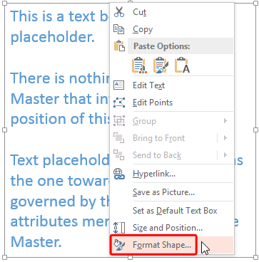
text box so that it shows a solid line with selection handles on its perimeter. Then right-click on the edge of the selected text box to bring up the
contextual menu and select the Format Shape option, as shown highlighted in red within
Figure 1.

Figure 1: Format Shape option
- This brings up the Format Shape
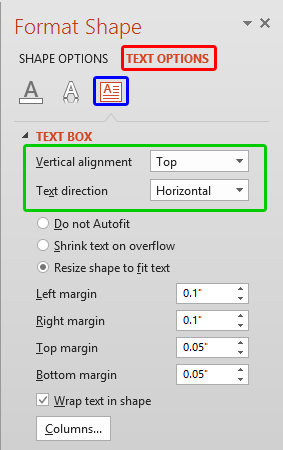
Task Pane (see Figure 2). Make sure you
choose the Text Options tab (highlighted in red within Figure 2). Then select the
Text Box button (highlighted in blue within Figure 2).

Figure 2: Text Box options within the Format Shape Task Pane
- Within the Format Shape Task Pane, locate the text alignment and direction options (area highlighted in
green within Figure 2, above). These options are explained below:
Vertical alignment
- Here you'll find various vertical alignment options related to the Text direction option you
choose. We look at Text direction next.
Text direction
- Enables you to rotate the text within the text box. Click the down-arrow next to the
Text direction option to bring up a drop-down list, as shown in Figure 3.

Figure 3: Text direction drop-down list
Tip:If you have worked aplenty with text in PowerPoint, you'll notice that text within the shape can be rotated by 90° and 270°, but
not by 180°. Explore our
Rotate Text 180° within Shapes in PowerPoint 2013 to find a
workaround for this problem.
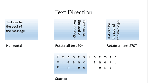
- In Figure 4, you can see a sample slide that contains four text boxes, each applied with all the four
Text direction options - look how the text direction influences the rotation plane of the text within the text box.

Figure 4: Text direction examples
- As you have already seen in Figures 3 and 4,
there are four Text direction options:
Horizontal
- This is the default Text direction option that provides you with conventional text on a straight plane as we are
normally accustomed to. When you select Horizontal text direction, your alignment is set as Vertical (refer to Figure 2, shown
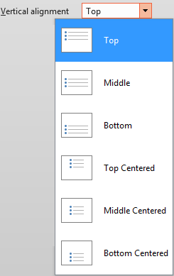
earlier on this page). Click this drop-down list to bring up the options shown in Figure 5. Here you can choose to align your text
to Top, Middle, or Bottom. You can also choose centered versions of these three, shown here as
Top Centered, Middle Centered, or Bottom Centered.

Figure 5: Vertical alignment drop-down list
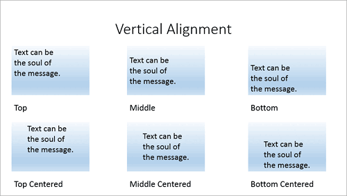
- Whichever option you choose, expect the alignment of text within the selected text container to
change. Figure 6 shows example of how the vertical alignment of text is influenced using these six variations.

Figure 6: Vertical alignment examples
Rotate all text 90o
- Choosing this option within the Text direction drop-down list (refer to
Figure 3, shown earlier on this page) rotates your text within the text container to the extent of 90o, as shown in the
second example on the top row of Figure 4, shown earlier on this page. The minute you select Rotate all text 90o option,
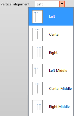
the alignment option will change to Horizontal alignment as shown in Figure 7.

Figure 7: Vertical alignment drop-down list
-
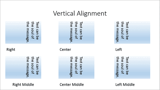
Clicking this drop-down list will bring forth options as shown in Figure 7. These options align your rotated text along the same
lines as horizontal (non-rotated) text, but results differ due to the direction of your text. Figure 8shows examples of how
vertical alignment of rotated text works.

Figure 8: Examples of vertical alignment of the text rotated to 90o
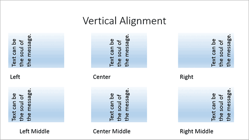
Rotate all text 270o
- This option works exactly like the Rotate all text 90o option, other than rotating the text in a completely opposite direction. Predictably, the alignments are still Horizontal (see Figure 9).

Figure 9: Vertical alignment drop-down list- Note the subtle differences in the location of the text shown in the sample slide
(compare Figures 10 and 8).

Figure 10: Examples of vertical alignment of the text rotated to 270o
Stacked
- This last option within the Text direction drop-down list (refer to Figure 3, shown
earlier on this page) stacks the text in vertical lines.
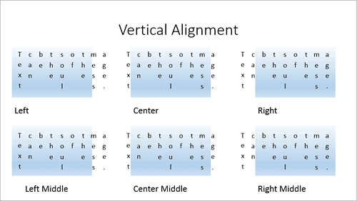
You can see examples of how the alignment of text within the text box is influenced by these six alignment variations in Figure 11,
below.

Figure 11: Examples of vertical alignment of the stacked text
-
Note that after changing the text direction to Stacked, you might need to resize the text box since these text boxes need a larger area to show all
the text. Note how the text flows outside the text box area in some of the samples you see in Figure 11, above.
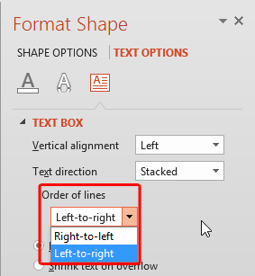
- When the text direction is changed to Stacked, you also see a new option called Order of lines
(highlighted in red within Figure 12) within the Format Shape Task Pane.
These options are either Right-to-left or Left-to-right. For normal English text that is read from
left to right, you will want to use the default Right-to-left option.

Figure 12: Order of lines options within the Format Shape Task Pane
- Play around with the text box layout options. Save your presentation often.
