Learn about surface charts, and how you can use them within PowerPoint. There are some variations for surface charts available within PowerPoint.
Author: Geetesh Bajaj
Product/Version: PowerPoint
OS: Microsoft Windows and Mac OS X

A surface chart is useful when you want to find optimum combinations between two sets of data, and compare it with a third data set. PowerPoint also includes contour charts as a subset of surface charts. As in a topographic map, colors and patterns indicate areas that are in the same range of values. Use a surface chart when both the horizontal and vertical axes contain numeric values so that you can add a depth axis (Z-axis) to end up with three axes. Also, don’t use surface charts when you can convey your message with a simpler chart.
Scroll down to the bottom of the page to see a sample presentation containing surface chart types and subtypes:
Surface charts have the following subtypes:
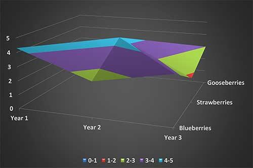
The 3-D surface chart subtype, shown in Figure 1, below, displays trends in values across two dimensions in a continuous curve. This is a 3-D view of the data that can be imagined as a rubber sheet stretched over a 3-D column chart. It is typically used to show relationships between large amounts of data that may otherwise be difficult to see.

Figure 1: The 3-D surface chart subtype
The color bands in a surface chart do not represent the data series; they represent the distinction between the values.
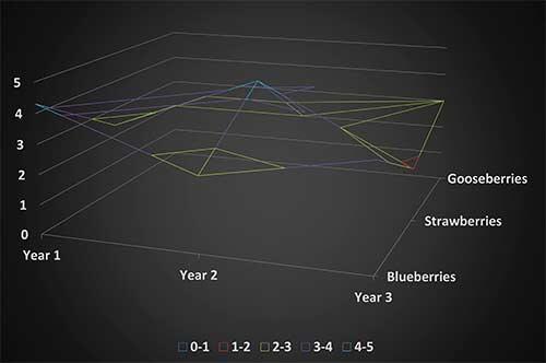
When displayed without color on the surface, as shown within Figure 2, below, a 3-D surface chart is called a wireframe 3-D surface chart. This chart shows only the lines, which in some cases is good because you can see overlapping lines which may be cobered in a normal 3-D surface chart.

Figure 2: The Wireframe 3-D surface chart subtype
In some situations, a wireframe 3-D surface chart is not easy to read. However, wireframe charts are useful for faster plotting of large data sets.
These charts are surface charts viewed from above, as shown in Figure 3, below. In some ways, this view makes them appear similar to 2-D topographic maps. In a contour chart, color bands represent specific ranges of values. The lines in a contour chart connect interpolated points of equal value.

Figure 3: The Contour surface chart subtype
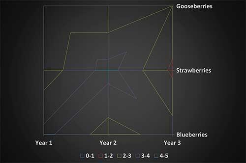
These charts are also surface charts viewed from above. Without color bands on the surface, a wireframe chart shows only the lines, as you can see in Figure 4, below.

Figure 4: The Wireframe Contour surface chart subtype
Wireframe contour charts are not easy to understand. In that case, you may want to use a 3-D surface chart instead.
Click below to view on SlideShare
Click below to view on YouTube
10 13 09 - PowerPoint Chart Types: Surface Charts in PowerPoint (Glossary Page)
You May Also Like: How to Create Custom PowerPoint Themes to Fit Your Brand | Food - C PowerPoint Templates


Microsoft and the Office logo are trademarks or registered trademarks of Microsoft Corporation in the United States and/or other countries.