What is a Stock Chart?
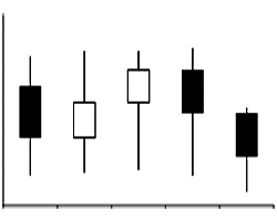
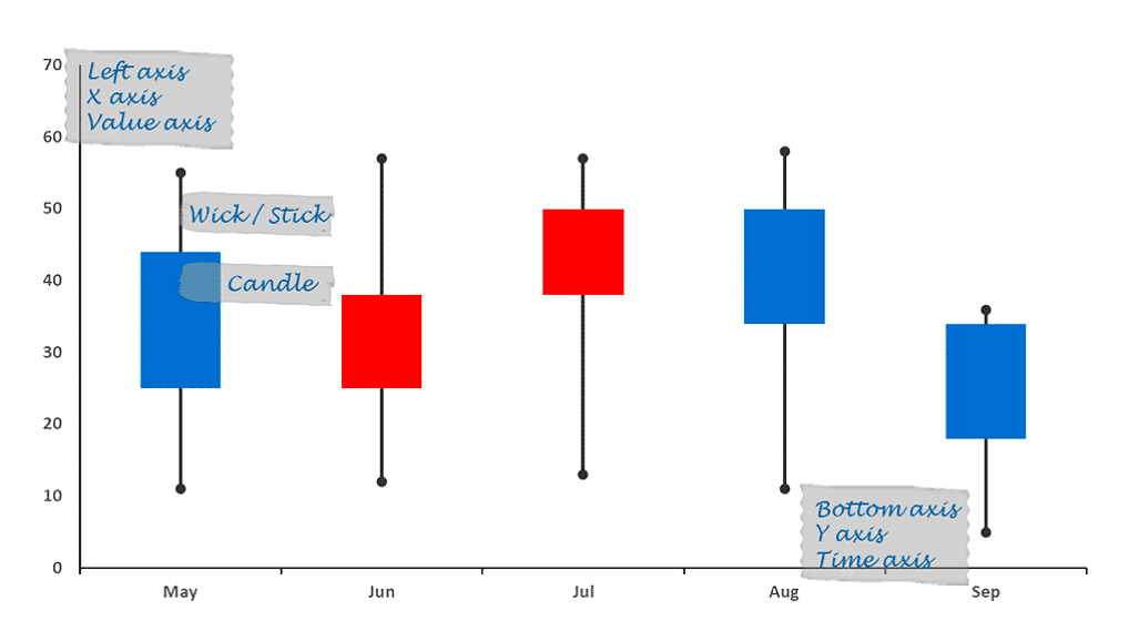
Figure 1: A basic candlestick stock chart
A stock chart is a price chart of a specific stock, plotted over a time frame. Stock charts created in PowerPoint can be both candle or stick charts, or both at the same time. In case they use both candle and stick shapes, they are called candlestick stock charts.
Most stock charts also mention the ticker or stock symbol of the stock. This ticker is typically an abbreviated name of the stock using 2 to 5 characters. Additionally, they also specify the exchange where this stock is traded.
The stock chart evolved from the Japanese rice charts, which represented the commodity prices of rice. The same principles were used for stock prices. Stock charts are also less commonly known as rice charts, and are more likely to be known as candlestick charts.
 Japanese Rice Charts
It is believed that a Japanese rice trader named Munehisa Homma created the first chart that evolved to become today's candlestick chart.
His charts with repeating patterns and trends for rice trading were based on data from Osaka's Dojima Rice Exchange.
Here are some points that will help you understand and create candlestick stock charts better:
- Professional stock charts, similar to what you see in Figure 2, below are created by large trading companies, and look different than the basic candlestick stock charts that you create in PowerPoint. These are double top and double bottom charts, and there's no easy way to create them in PowerPoint. However, the concepts are similar to the candlestick stock charts we are exploring.

Figure 2: Traders exploring falling and rising quotes at a stock exchange using a professional stock chart
Image: Yay Images- In candlestick stock charts, the left axis relates to the value of the stock whereas the botton axis represents the time span of the stock traded. This time span could be a day, a week, a month, or even part of a day for intra-day trading. Both axes can be seen in Figure 3, below.

Figure 3: Elements of a stock chart - Although these charts are best known as candlestick charts, they are also known as candle charts because they look like a candle with wicks on both the top and the bottom ends of the candle.
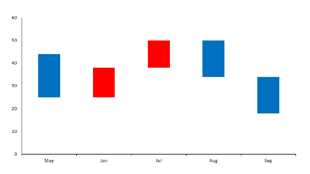
- While most stock charts include both the candle and wick parts, some stock charts may only include the candle part, as shown in Figure 4, below.

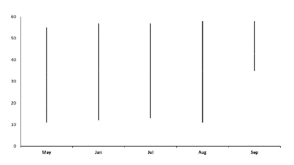
Figure 4: Candle charts - Other charts may include only the wick part, as shown in Figure 5, below. In such cases, they may also be known as stick charts, where the wick without the candle is now called the stick.

Figure 5: Wick or stick charts - The candle part represents the opening and closing stock price.
- Stocks that increased in price are often shown as black, green, or blue candles. Stocks that decreased in price are shown as white or red candles. These colors are merely the ones that are often used, and it is not necessary that you must match these colors. Determine what colors are typically used within your organization or sphere of work, and use the same colors.
- The top wick, or the top part of the stick indicates the highest price at which the stock was traded. Similarly, the bottom wick, or the bottom part of the stick indicates the lowest price at which the stock was traded in the given trading period.
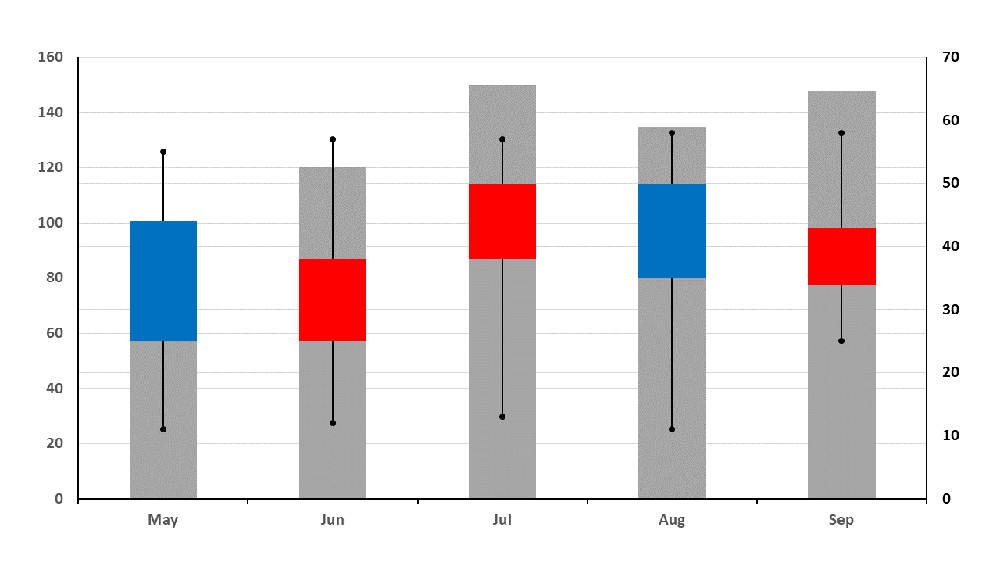
- In addition to the open, close, high, and low values, some stock charts also add an extra category called volume, which is the total volume traded within the given time period. The volume traded is shown as grey columns in Figure 6, below. In such cases, the chart may have two vertical axes, one that reflects the volume, and the second vertical axis reflects values for the remaining categories.

Figure 6: Stock chart with volume of trade

 Japanese Rice Charts
