Learn why 3D charts may not be the most suitable to show data. This entire series is also available in the form of an ebook.
Author: Geetesh Bajaj
Product/Version: PowerPoint
OS: Microsoft Windows and Mac OS X
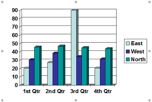
In the days of PowerPoint 2003 and older versions, you just had to insert a chart to end up with a 3D chart! Yes, that's true! Figure 1, below, shows the default column chart you inserted in those versions. To say that this chart looks horrible is an understatement.

Figure 1: Default chart in PowerPoint 2003 and older versions
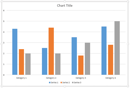
Comparatively, the default column chart you add in newer versions of PowerPoint is so much more cleaner, as shown in Figure 2, below.

Figure 2: Default chart in newer PowerPoint versions
Of course, changing the defaults does not mean that you will not encounter any 3D charts since even in newer versions, it is fairly easy to change a chart from 2D to 3D. There are plenty of 3D charts to be seen even today. Even now, there are people who love 3D charts just because it might make them look like a pro. Well, that's a big mistake! 3D charts don't make you look like a pro.
Let's look at an analogy to understand this better. Do you need 3D text jumping out from your business card for every alphabet? Then you are right, you do not need 3D charts at all.
There are exceptions though, especially if your data needs a 3rd Z axis. But most charts do not need a Z axis. So, stay away from 3D charts; your viewers will thank you.
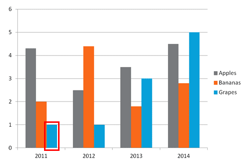
Another reason why you cannot use 3D charts is because some data can become invisible. Look at the non-3D chart, as shown in Figure 3, below and notice that the column representing Grapes for 2011, as shown highlighted in red within Figure 3, is fairly shorter than other columns in the same chart. Yet you can see the column.

Figure 3: A shorter column in a non-3D chart
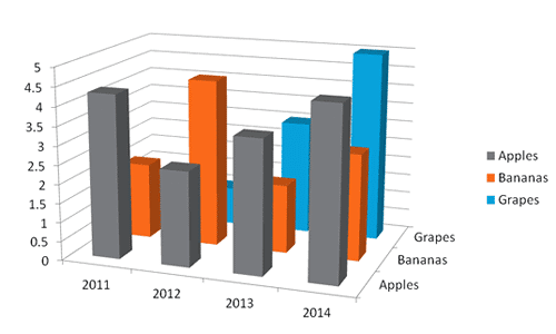
And now look at the same data used for a 3D chart in Figure 4, below. Yes, the same column is existent here but since the column itself is shorter, you can no longer see it at all!

Figure 4: 3D charts can hide some columns!
This is just another reason to stay away from 3D charts.
10 15 08 - Ten Tips for Cool PowerPoint Charts: PowerPoint Chart Tips 07: Stay Away From 3D Charts (Glossary Page)
You May Also Like: Presentations Cost Salespeople 50+ Hours Every Month | Blackberries PowerPoint Templates


Microsoft and the Office logo are trademarks or registered trademarks of Microsoft Corporation in the United States and/or other countries.