If you want to create movie-credits style animations in PowerPoint, you will miss the Crawl Entrance animation option that was available in older versions of PowerPoint. You can substitute Crawl with Fly In, and change the animation speed to something slower such as 15 seconds, and also set the direction of the Fly In animation to From Bottom.
The Star Wars-credits style is a variant of the Crawl animation. In this style, the text crawls from the bottom to the top, as it also does with Crawl. Additionally, the text diminishes in size all the time until it fades into oblivion. This is a really neat effect, and it is possible to accomplish it in PowerPoint 2013 if you combine multiple animations.
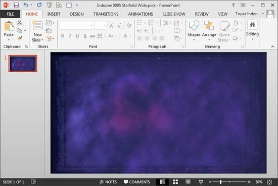
To get started, you may optionally download our ready-to-use Starfield PowerPoint template that already has a night sky background image. In the download, you will find the Starfield template is available in both standard and widescreen resolutions. You can use the one that you prefer. Before we proceed further, do remember to save your presentation after each step!
Follow these steps to create Star Wars style credits animation in PowerPoint 2013 for Windows:
- Double-click the Starfield PowerPoint template file to create a new PowerPoint presentation, based on this template. First, save the file with a new name. Your saved presentation may now have two slides. Delete one of the slides so that there is only one slide left. Then, change the slide layout of the remaining slide to Blank, as shown in Figure 1, below.

Figure 1: Slide layout changed to Blank - Now insert a Text Box on your slide and type one or two lines of the credits text, as shown in Figure 2, below. With the text box still selected, align the text to the center of the Text Box and align the Text Box to the center of the slide as shown in Figure 2. As the background is dark, the text needs to be in white or another lighter color. You might also want to make the text bold and/or increase the size of the font, as again shown in Figure 2.

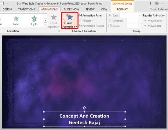
Figure 2: Text added - Now, drag the Text Box to the bottom center of the slide and choose the Animations tab on the Ribbon, as shown in Figure 3, below. With the Text Box still selected, click the Add Animation button, as shown highlighted in red within Figure 3.

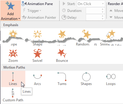
Figure 3: Add Animation button - Doing so brings up the Add Animation drop-down gallery. Choose the Motion Paths | Lines animation option, as shown in Figure 4, below.

Figure 4: Add Line animation - You will now find that the selected text box on the slide has a Motion Path animation applied, as shown in Figure 5, below. This is indicated by the Line you see which has a reversed green arrowhead on one side, and a red arrowhead on the other, as shown in Figure 5. This actually indicates that this Motion Path animation plays towards the Down direction.

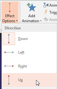
Figure 5: Motion Path animation applied - We need to change the direction of the Motion Path to Up. To do so, access the Animations tab on the Ribbon with your text box still selected. Then, click the Effect Options button. From the drop-down menu that appears, choose the Up option, as shown in Figure 6, below.

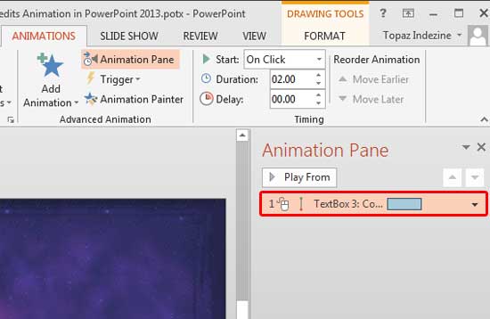
Figure 6: Up effect option - Within the Animations tab of the Ribbon, now click the Animation Pane button to bring up the Animation Pane, as shown in Figure 7, below. Within the Animation Pane, double-click the Motion Path animation, as shown highlighted in red within Figure 7.

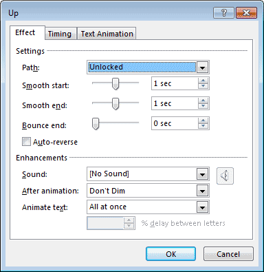
Figure 7: Motion Path within Animation Pane - Doing so will bring up the Up dialog box, as shown in Figure 8, below. Within this dialog box, access the Effect tab, and match your values to the ones shown in Figure 8, below.

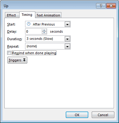
Figure 8: Effect tab within Up dialog box - Next, access the Timing tab in the same dialog box and match your values to the ones, as shown in Figure 9, below.

Figure 9: Timing tab within Up dialog box - Now select the Motion Path on your slide. This is the path that has a green and a red arrowhead on either side. If you see two white handles on either side of the Motion Path, you then know that the path is selected.

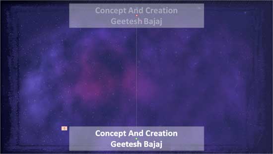
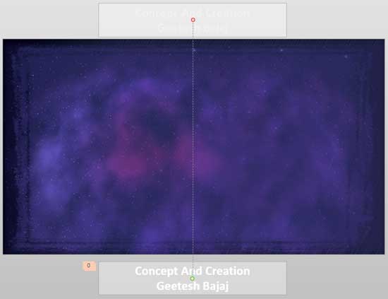
Figure 10: Fine-tuned motion path - Drag the white handle on the top of your Motion Path to the top of the slide. Ensure that the bottom of the Motion Path is somewhere close to the bottom of your slide, as shown in Figure 10. You might want to preview the animation to fine-tune the placements of the top and bottom ends of your Motion Path.
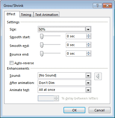
- With your text box still selected, add another animation. The animation you need to add now is Emphasis | Grow/Shrink. Next, double-click the Grow/Shink animation in the Animation Pane, as previously explained in Step 7. Within the Effect tab of the Grow/Shrink dialog box, match your values to the ones you see in Figure 11, below.

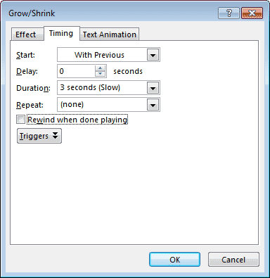
Figure 11: Effect tab within Grow/Shrink dialog box - Similarly, access the Timing tab of the same dialog box, and match your values to those shown in Figure 12, below. Do note that we changed the Start value to With Previous. This ensures that the selected animation will happen along with our previous animation, simultaneously.

Figure 12: Timing tab within Grow/Shrink dialog box - Let us now explore what we have achieved so far. The first animation we added was a Motion Path that moved the text box from the bottom of the slide upwards. The second animation was an Emphasis animation that reduced the size of the text box. Moreover, the second animation happened at the same time as the first one. We still need to add a third animation so that our text box fades into oblivion as it exits upwards from the slide.
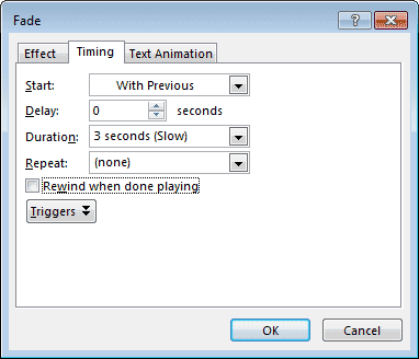
- To do so, make sure that your text box is selected. Then, add an Exit | Fade animation. Next, double-click the Fade animation in the Animation Pane, as previously explained in Step 7. Within the Timing tab of the Fade dialog box, match your values to the ones you see in Figure 13, below.

Figure 13: Timing tab within Fade dialog box - Since we require all three animations to happen simultaneously, we chose the same speed for all three. Notice that the Duration value is set to 3 seconds (Slow) in Figure 13, above. You will notice the same durations for the other two animations in Figures 9 and 12. If you want to choose a different speed, you’ll need to change the Duration value in all three animations.
- Next, drag the text box downwards to outside the Slide Area. This will ensure that the text is not seen in a non-animated state while viewing in Slide Show view. Preview and fine-tune again as required. You might want to extend the motion path upwards to compensate for the added downward distance of the text box, as shown in Figure 14, below.

Figure 14: Text re-arranged - Duplicate the text box by copying and pasting as many text boxes you need. Change the text credits as required by typing over the existing text, and then place the new text boxes immediately over the earlier text box. You will repeat to create as many text boxes as required. Since, all the text boxes overlap each other, it might be a little difficult to edit the text within them later. Use the Tab key to select each of these text boxes one at a time so that you don’t make changes inadvertently in a text box that you did not intend to edit!
- Preview your slide. You might also want to download a copy of the presentation we created to check the settings used.
More Ideas
- We just duplicated an animated text box within the same slide. You can carry this concept forward to duplicate text boxes across slides and even presentations, thus making short work of an otherwise tedious job.
- Experiment with adding a Star Wars style soundtrack to the credits slide. You can search the internet for a Star Wars theme sound in WAV or MP3 format. Whatever you do, make sure you are respecting copyright implications.
