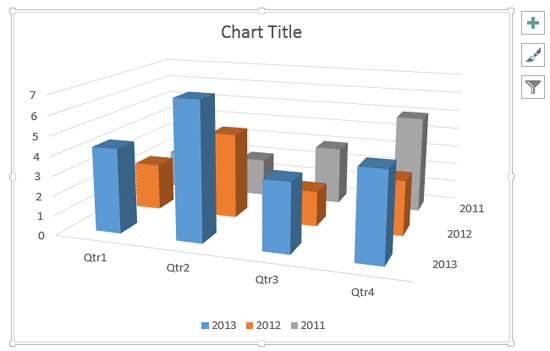
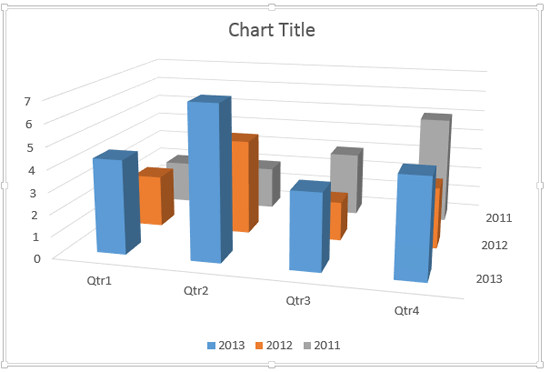
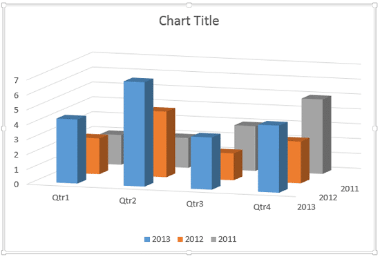
In a 3D chart, when there are columns of various heights, it's possible that some of the taller columns hide other shorter columns placed behind them, as shown in Figure 1, below. This is especially true with 3D charts that have a Z axis.

Figure 1: One of the Series 3 columns is completely hidden
One of the ways to make the columns placed behind visible is to make the taller columns transparent. The other way to solve this issue is to rotate the 3D chart a little so that you end up with a better view where the shorter columns become clearly visible.
Follow these steps to explore rotation of 3D charts in PowerPoint 2013 for Windows:
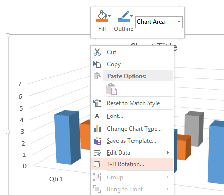
- Select the Chart Area. Now, right-click to bring up the contextual menu, you see in Figure 2, below. Within this contextual menu, select the 3-D Rotation option (refer to Figure 2, again).

Figure 2: 3-D Rotation option selected Right-Click Contextual Menus
- For this tutorial, we selected the Chart Area to bring up the right-click contextual menu. You can similarly select any chart element and right-click to bring up a similar contextual menu.
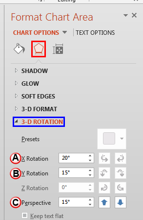
- Doing so brings up the Format Chart Area Task Pane that you see in Figure 3, below. Make sure that the Effects button is clicked as shown highlighted in red within Figure 3, and also that the 3-D Rotation option is selected as shown highlighted in blue within Figure 3. Here you can find the X Rotation, Y Rotation, and Perspective options (marked as A, B and C within Figure 3).

Figure 3: 3-D Rotation options within the Format Chart Area Task Pane Why Can't You Rotate the Chart on the Z Axis?
- Did you notice that Z Axis rotation options are grayed out in Figure 3, above? That's because you can't rotate the chart on the Z (depth) axis. If PowerPoint allowed Z axis rotation, your chart columns would not stand straight and would start leaning! That's the reason why charts can be rotated on the X (horizontal) and Y (vertical) axes but never on the Z (depth) axis.
- Let us explore chart rotation options in PowerPoint 2013 for Windows, as marked in Figure 3, above:
A. X Rotation
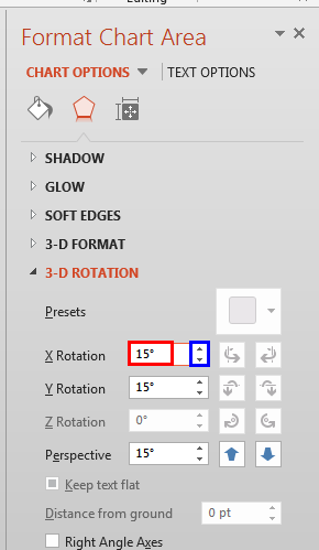
- Specify the number of degrees to which you want to rotate the chart on X axis. We changed the X axis rotation value to 15 degrees, as shown highlighted in red within Figure 4, below. You can directly type in the required value (number of degrees) within the box, or increase or decrease the value using the up and down arrow buttons next to the box, as shown highlighted in blue within Figure 4.

Figure 4: X axis rotation changed to 15 degrees - This action rotates the chart around the X axis to the specified number of degrees. Figure 5, below shows our sample chart with X axis rotation decreased from 20 to 15 degrees. Also note that the grey column that was hidden earlier (refer to Figure 1, shown earlier on this page) is visible now. You now see all the 4 grey columns rather than the 3 visible in Figure 1.

Figure 5: Decreasing the X axis rotation value has made the hidden column visible B. Y Rotation
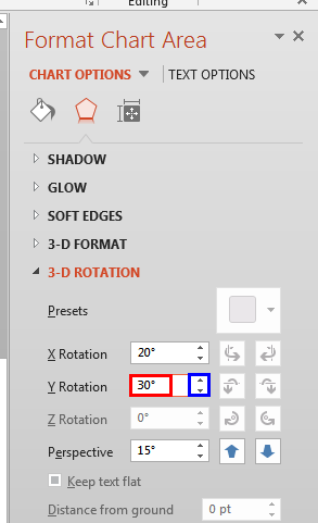
- This option is used to adjust the Y axis rotation of the chart. Here, specify the number of degrees to which you want to rotate the chart on Y axis. As mentioned earlier, you can directly type in the required value (number of degrees) within the box, as shown highlighted in red within Figure 6, or increase or decrease the value using the up and down arrow buttons next to the box, as shown highlighted in blue within Figure 6. In Figure 6, below you can see that we have increased the Y axis rotation value from 15 degrees to 30 degrees.

Figure 6: Y axis rotation changed to 30 degrees - This action rotates the chart around Y axis to the specified number of degrees. Figure 7, below shows our sample chart with Y axis rotation increased form 15 degrees to 30 degrees. Also note that the column that was hidden earlier (refer to Figure 1, shown earlier on this page) is partially visible now.

Figure 7: Increasing the Y axis rotation value has made the hidden column partially visible Y Axis Rotations
- Rotating the chart on Y axis may result in your chart appearing as viewed from a horizontal base level, the sky, or even below the base level. Play with different rotation values to come up with a Y axis rotation value that works best for your chart.
C. Perspective
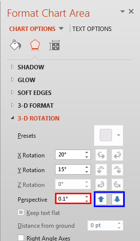
- To change the depth of view of the chart, type the degree of perspective that you want within the Perspective box, as shown highlighted in red within Figure 8, below, or use the up and down arrow buttons, as shown highlighted in blue within Figure 8, below, to manipulate the rotation until you have achieved the results you want.

Figure 8: X, Y, and Perspective values changed No Perspective?
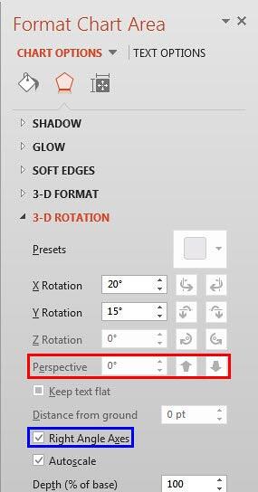
- Is the Perspective option grayed out, as shown highlighted in red within Figure 9, below. This is because the Right Angle Axes check-box is selected, as shown highlighted in blue within the same figure. You will have to deselect the Right Angle Axes check-box to activate the Perspective option.

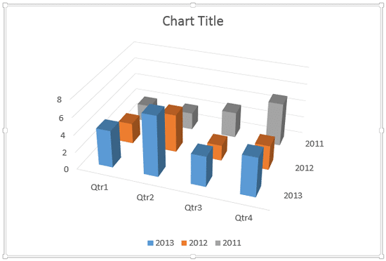
Figure 9: Perspective option greyed out - By adjusting all three of the rotation options together, you can get better results. Look at Figure 10, below where you can see the chart for which we have changed all the X, Y and Perspective values.

Figure 10: Changing X, Y, and Perspective values has made all columns visible - Compare the charts within Figures 1, 5, 7, and 10. You can see all columns clearly in Figure 10.
- Save your presentation often.
