Are you pleased with the default locations where PowerPoint places your axis labels? Yes, we do believe that the defaults do work best because audiences expect these labels to exist at these familiar locations. However, there may be times when you probably don't even need labels for your axes, or you may want them placed in another location so that your charts look cleaner. Whatever your purpose may be, it is indeed possible to change the position of axis labels vis-à-vis the axis.
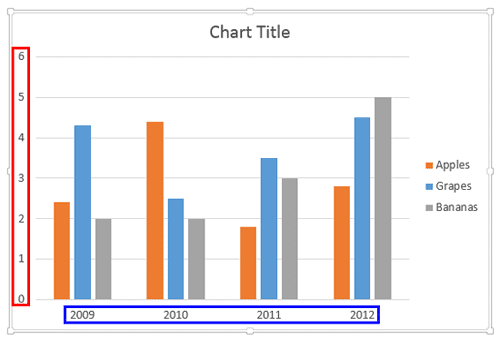
Figure 1, shows a chart in PowerPoint 2013 for Windows that we are using as the starting point for this tutorial. Since, we make changes to the position of the axis labels later in this tutorial, compare the changes with this chart, that we started with. In Figure 1, the value axis labels are highlighted in red and the category axis labels are similarly highlighted in blue.

Figure 1: Default position of axis labels in a column chart
Both value as well as category axis labels have four position options. Follow these steps to explore them:
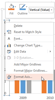
- Select the value axis or category axis of the chart depending upon which axis label you want to edit, and right-click to access the contextual menu, as shown in Figure 2, below. From the contextual menu, choose the Format Axis option, as shown in Figure 2 again. If you do not see the Format Axis option in the contextual menu, you may have right-clicked on another chart element. Make sure you then deselect everything in the chart, and then right-click on the value axis or category axis again and choose the Format Axis option.

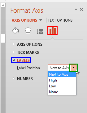
Figure 2: Format Axis option selected for the value axis - Doing so opens the Format Axis Task Pane, as shown in Figure 3, below. Make sure that the Axis Options button is selected, as shown highlighted in red within Figure 3. Then, select the Labels option, highlighted in blue within Figure 3. Thereafter, click the down-arrow, as shown highlighted in green within Figure 3, next to the Label Position option. This action opens the Label Position drop-down menu which provides you with four position options (refer to Figure 3 again).

Figure 3: Position options for the Axis labels - Let us explore these position options for the axis labels of the selected axis:
Next to Axis
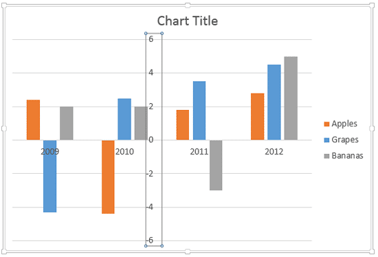
- This is the default option. When this option is selected for both the axes, the charts with non-crossed axes appear as shown in Figure 1, previously on this page. Chart with crossed axes appears as shown in Figure 4, below. To understand more about crossing axes, explore our Crossed Axes tutorial.

Figure 4: Axes labels set to Next to Axis in a chart having axes crossing each other High
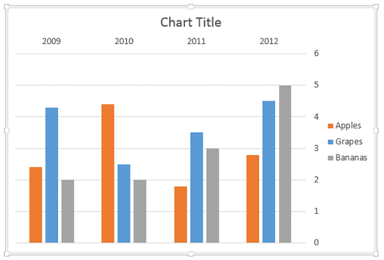
- This option works similarly for both the category and value axes. It shows the labels in the position of what would be your secondary axis. When selected for the category axis, this option moves the axis labels above the plot area. When selected for the value axis, this option moves the axis labels to the right side of the plot area. Changes for both axes can be seen in Figure 5 (compare with Figure 1, shown previously on this page).

Figure 5: Axes labels set to High Low
- When you select the Low option for a typical chart in which the value and category axes are placed on the left and bottom sides respectively of the Plot Area, you won't see any differences in the axis label positions. They will still show in their default position, i.e., Next to Axis, as shown previously in Figure 1.
- For the Low option to show any visual change, one or both your axes must cross the plot area as shown in Figure 4, earlier on this page. Figure 4 shows you how the axis labels are positioned when both the value and category axes are crossing each other in the middle of the chart. Note that whatever you see in Figure 4 is a result of applying the Next to Axis position option to both the axes. Clearly the chart does not look neat at all, and the Low option will help you to set it right.
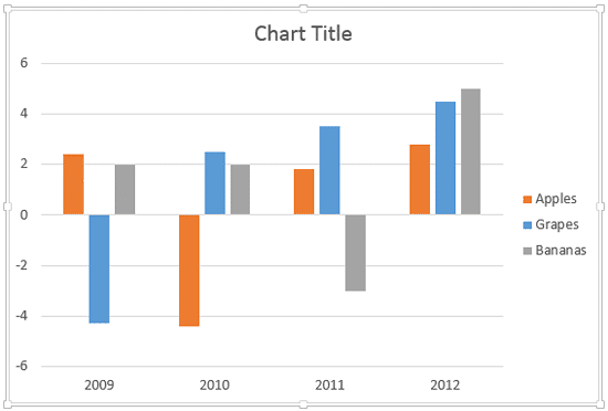
- We now changed the axis labels' position to Low to end up with a much cleaner chart, as shown in Figure 6, below. The horizontal axis label moved below the plot area whereas vertical axis label moved to the left side of the plot area (compare with Figure 4, shown earlier on this page).

Figure 6: Axes labels set to Low in a chart having axes crossing each other None
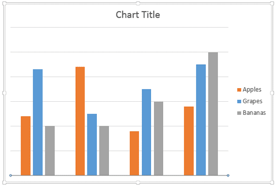
- Hides the axis labels for the selected Axis. We choose this option for both axes. You can see the resultant chart in Figure 7, below. Note that you don't need to hide both axes labels. You can certainly hide one of them and opt to show the other.

Figure 7: Axes labels hidden for both axes - Position the axes labels as required, and save your presentation.
