Read an exclusive book excerpt from PowerPoint 2007 for Windows: Complete Makeover Kit.
Author: Geetesh Bajaj
Product/Version: PowerPoint
This book extract is from PowerPoint 2007: Complete Makeover Kit by Geetesh Bajaj and Echo Swinford.
This book is not as much about reading as it is about seeing and doing! That's why it's called a kit. Full-color pages show you exactly how your slides will look as you follow the makeover steps, and all presentations in various stages of the makeover are on the accompanying CD. Each of the eight makeovers has been carefully chosen so it's relevant to anyone who has ever used PowerPoint. And if you just upgraded to PowerPoint 2007, this book gives you a great introduction to the new version of the program, along with ample experience in using all the new features.
I wish to thank Lisa Jacobson Brown of Pearson Education for facilitating the permission to extract.
About This Makeover
Apply a Clean Theme
For this makeover, I used an award-winning presentation created by the team of Scott Schwertly and Cheree Moore at Ethos3 Communications. I wish to thank them for allowing me to use their presentation.
Unlike in other makeovers in this book, this presentation is a concept makeover rather than a new-features-in-PowerPoint makeover.
This presentation uses no bullets, and often uses pictures instead of words to create "concept slides." A picture of a cup of coffee represents coffee much better than just the word "coffee" because so much more is visible in a picture: There's the cup, the froth in the coffee, and the color of the coffee itself. Thus pictures engage the audience—people can form their own stories, and they will pay more attention to the presentation because they are more involved this way.
The way you present your message can be more important than the message itself. This is especially true if you want to use PowerPoint to illustrate a concept rather than just show some numbers. True, this no-bullets style of presentation might not be suitable (or even possible) all the time, but if you used this style all the time, it might not be as effective. Thus, the secret is to use this style in the opening or closing slides of a conventional presentation, and when the situation permits, you also can use it in an entire presentation, as we did in this makeover.
Remember that this presentation style does not reduce the number of slides you'll have to make—every slide that includes a title and four bullet points now must be changed to five slides: one for the title and one concept slide for each individual bullet!
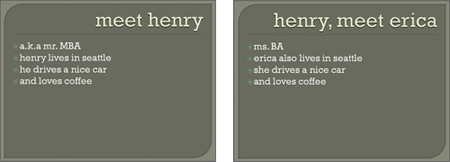
Figure 8.1 shows you the "before" sample slides. Although the text looks crisp and clear, the presentation itself lacks life because it tries to tell a story using just a few words. The words that are used get lost because there are so many of them on a single slide, and I haven't even come to the visuals yet.

Figure 8.1 These were created using one of the built-in design themes contained in PowerPoint 2007.
To see how much difference a few words and visuals can make, go no further than Figure 8.2. This is the same content presented in slides that build on each other using a story sequence style.

Figure 8.2 Nothing more, nothing less, and just enough!
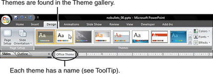
The first thing you need to do to make over this presentation is apply a clean theme or template. A clean theme is a simple slide design that includes a plain white background—think of it as an empty canvas. Applying a clean theme allows the pictures to stand out well. To apply the theme, follow these steps:

Figure 8.3 Apply a clean theme.
You May Also Like: Bring Your Human to Work: Conversation with Erica Keswin | China Flags and Maps PowerPoint Templates


Microsoft and the Office logo are trademarks or registered trademarks of Microsoft Corporation in the United States and/or other countries.