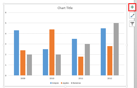
You might have noticed that by default, PowerPoint 2013 for Windows only shows Horizontal Major Gridlines on a chart, as shown in Figure 1.

Figure 1: Chart showing default status of Gridlines
Yes, you can enable Vertical Gridlines too as we explored in our Chart Gridlines in PowerPoint 2013 for Windows tutorial, and more importantly you can format these Gridlines to appear exactly as you want. In this tutorial, we will look at these format options:
- You first need to have a chart in your presentation. If you don't have an existing chart, insert a new chart on your slide. Now, select the chart and click the Chart Elements button highlighted in red within Figure 1, above.
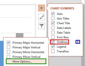
- Doing so opens the Chart Elements gallery as shown in Figure 2, below. Within the Chart Elements gallery, select the Gridlines check-box (highlighted in red within Figure 2). This step ensures that the Primary Major Horizontal Gridlines are visible on the chart, and also reveals a right-arrow, as shown highlighted in blue within Figure 2. Click this right-arrow to open the Gridlines sub-gallery. Within this sub-gallery, select More Options (highlighted in green within Figure 2).

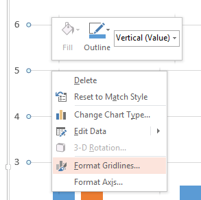
Figure 2: More Options - Alternatively, if you have Gridlines visible on your chart, carefully right-click any Gridline to bring up a contextual menu shown in Figure 3, below. Within this contextual menu, select the Format Gridlines option (refer to Figure 3 again). If you do not get to see the Format Gridlines option in the contextual menu, you might have right-clicked on another chart element instead of the Gridline. You need to then deselect everything in the chart, and make sure you right-click on the Gridline.

Figure 3: Format Gridlines option - Either way, this opens the Format Major Gridlines Task Pane, as shown in Figure 4. Note that the name of this Task Pane may be different depending upon the type of Gridline you have selected.

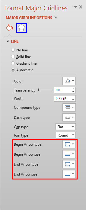
Figure 4: Format Major Gridlines Task Pane - Let us explore options that you see in Figure 4. Again, do note that some of these options listed below link to further tutorials with more detail. Although the linked tutorials pertain to shapes, the same principles hold good for lines related to the Gridlines.
No line
- Removes Gridlines altogether.
Solid line
- This option is used to apply a solid color fill to Gridlines of the selected Chart Area. You can use any of the Theme colors, Standard colors, or any other color of your choice. To learn more about this option, read our Formatting Lines (and Shape Outlines) in PowerPoint 2013 tutorial.
Gradient line
- This option applies a gradient fill to the Chart Gridlines. A gradient is a blend of two or more colors merging into each other. Learn more in our Gradient Outlines in PowerPoint 2013 tutorial.
Automatic
- Selecting this option gets back the automatic line style of the Chart Gridlines. It cancels any line style that you might have applied manually, and restores the default Chart Gridlines.
- When you select any of the options other than No line, you may also be provided with various line editing options. These are:
Color
- Used to select a color for the Chart Gridlines.
- If your selected Gridline is a Gradient line, then this option will be available to choose the color of the selected Gradient Stop. Learn more in our Gradient Outlines in PowerPoint 2013 tutorial.
Transparency
- Used to set the transparency value for the selected Chart Gridlines.
Width
- Adds a weight for the Gridlines in points. To learn more about this option, read our Formatting Weight Attribute for Shape Outline in PowerPoint 2013 tutorial.
Compound type
- Selecting this option reveals a drop-down menu from where you can choose any of the compound types available for Gridlines. Note that compound lines in PowerPoint are limited to two or three lines compounded to each other.
Dash type
- This option allows you to apply dash attributes to the Gridlines. Learn more about Formatting Dash Attribute for Shape Outline in PowerPoint 2013 -- Dash tutorial.
Cap type
- This allows you to choose between a Square, Round, or Flat line end type.
Joint type
- This allows you to choose between Round, Bevel, and Miter joints. This really doesn't make any difference to the Gridlines.
Arrow type and size options
- The four options, Begin Arrow type, Begin Arrow size, End Arrow type, and End Arrow size are used to add and modify the arrow heads to the Gridlines. To know more about these options, refer to our Formatting Arrows (Arrowheads) in PowerPoint 2013 tutorial.
Note: Other than
Line options, there are also some
Effect options available for the Gridlines which can be accessed by clicking the
Effect tab (shown highlighted in
blue within
Figure 4 earlier on this page). The three Effects available for Gridlines are
Shadow,
Glow, and
Soft Edges. To know more about how to use these options, refer to our
Effect Options for the Chart Area in PowerPoint 2013 tutorial. Although the linked tutorial pertains to
Chart Area, the same principles hold good for lines related to the Gridlines.
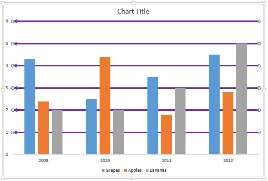
- Select the appropriate options and format the Gridlines as required. In Figure 5, below, you can see our sample chart with formatted Gridlines. Notice that we have changed the color, increased the thickness (weight), and also added arrow-heads to Gridlines (compare with the chart shown in Figure 1, earlier on this page).

Figure 5: Chart with formatted Gridlines Tip: The sample chart you see in Figure 5 has thick gridlines with no transparency. This was done to show you how these options work, and is not necessarily what you will use in your charts. The best charts have gridlines that are only slightly visible.
- Save your presentation often.
