Adding data labels is one of the ways in which you can make your charts in PowerPoint more effective, informative, and relevant to your audience. Once added, you can also further change the appearance of the data labels to suit your requirements, as explained in this tutorial.
To begin, you need a chart on your slide. If you don't have one, insert a chart on your slide. Thereafter, follow these steps to change the appearance of data labels in PowerPoint 2013 for Windows:
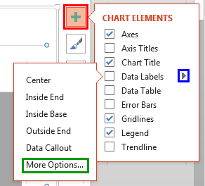
- Select the chart and click the Chart Elements button on the top right of the chart. This button is the plus sign highlighted in red within Figure 1, below. Doing so opens the Chart Elements gallery. Within the Chart Elements gallery, hover your cursor over the Data Labels option. This brings up a right-arrow as shown highlighted in blue within Figure 1. Click this right-arrow to open the Data Labels sub-gallery. Within this sub-gallery, select More Options, highlighted in green within Figure 1.

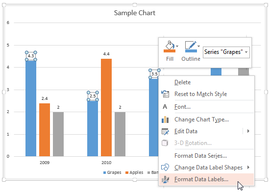
Figure 1: More Options - Alternatively, select data labels of any data series in your chart and right-click to bring up a contextual menu, as shown in Figure 2, below. From this menu, choose the Format Data Labels option.

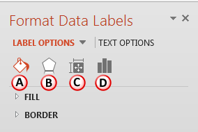
Figure 2: Format Data Labels option - Either of these options opens the Format Data Labels Task Pane, as shown in Figure 3, below. In this Task Pane, you'll find the Label Options and Text Options tabs. These two tabs provide you with all chart data label formatting options.

Figure 3: Format Data Labels Task Pane - Let us start with exploring options within the Label Options tab, as shown in Figure 3, above. Do note that some of these options listed below link to further tutorials with more details. Although the linked tutorials do not pertain specifically to data labels, the principles explained hold good for data labels too.
A. Fill & Line
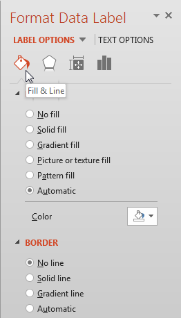
- Here you will find various Fill and Border options for the data labels, as shown in Figure 4, below.

Figure 4: Fill and Line options for data labels Fill
- Includes various options that are used to format the fill of the text box containing data labels.
Border
- Includes various options that are used to format the outline of the text box containing data labels.
- To learn more about these options, refer to our Fill and Line Options for the Chart Area in PowerPoint 2013 tutorial. Although the linked tutorial pertains to the chart area, the principles explained work similarly for data labels too.
B. Effects
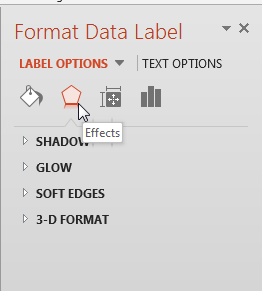
- There are four effects available for the text box that contains data labels, as shown in Figure 5, below.

Figure 5: Effects options for chart data labels - To explore more, refer to our Effect Options for Chart Area in PowerPoint 2013 tutorial. Although the linked tutorial pertains to the chart area, the principles explained work similarly for data labels.
C. Size & Properties
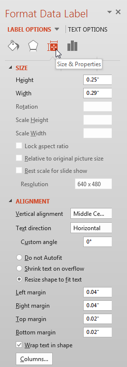
- Using options shown within Figure 6, below, you can change the size of the text box that contains data labels, and also control other aspects such as alignment and direction of the text, margins, etc.

Figure 6: Size & Properties option within Format Data Table Task Pane - To learn more about Size & Properties options, refer to our Text Layout Options in PowerPoint 2013 and Text Box Autofit Options in PowerPoint 2013 tutorials.
D. Label Options
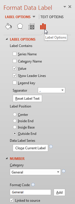
- These options, shown in Figure 7, below, are used to edit content, position, and format of data labels.

Figure 7: Label Options within Format Data Table Task Pane - Explore more about these options in our Label Options for Chart Data Labels in PowerPoint 2013 tutorial.
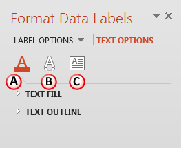
- The Text Options tab of the Format Data Labels Task Pane, as shown highlighted in red within Figure 8, below, provides you with text editing options for your chart data labels text, as shown in Figure 8.

Figure 8: Text Options tab within the Format Data Labels Task Pane - Let us explore options within the Text Options tab, as marked in Figure 8.
A. Text Fill & Outline
- Change the text fill and outline of the data lable text, as explained in our Text Fill & Outline Options for Chart Area in PowerPoint 2013 tutorial.
B. Text Effects
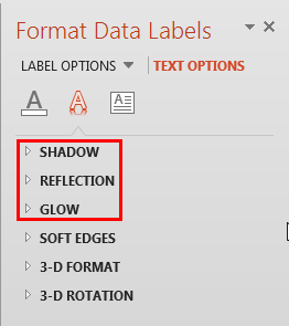
- Choose from Shadow, Reflection, and Glow effects, as shown highlighted in red within Figure 9, below, to make your data lable text stand apart.

Figure 9: Text Effects for Chart Data Labels - For more information, refer to our Text Effects Options for Chart Area in PowerPoint 2013 tutorial. Although the linked tutorial pertains to the chart area, the principles explained work similarly for data labels.
C. Text Box
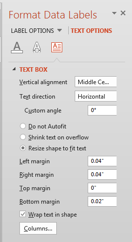
- Clicking the Text Box button reveals text alignment options for the data labels, as shown in Figure 10, below.

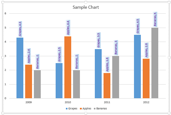
Figure 10: Text box options for chart data labels - Select required option and format data lables, as required. Figure 11, below, shows our sample chart with formatted data labels. Compare with the chart in Figure 2, shown previously on this page.

Figure 11: Chart with formatted data labels - Save your presentation often.
