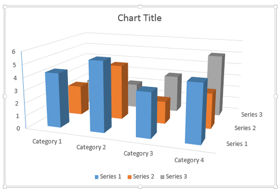
It's good to avoid using 3D charts unless your chart data requires a Z-axis. Having said that, we have chosen the topic of making your 3D columns in a chart transparent. Yes, there's a reason to do so especially when you find that some of the columns in your 3D chart may be hiding behind one or more of the other columns, just because they are not tall enough. Look at the chart shown in Figure 1, below. Notice that one of the grey columns (category 1, series 3) is almost hidden.

Figure 1: One of the Series 3 columns is completely hidden
Continuing our observation, we need to find a way to make the mostly hidden grey column visible! One easy solution for this problem is to reduce the opacity of the columns in the front.
Follow these steps to learn more about how to make 3D columns transparent for charts in PowerPoint 2013 for Windows:
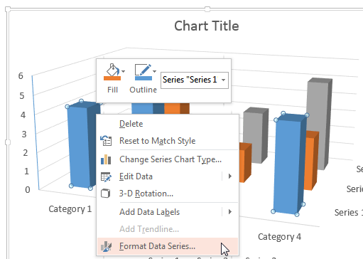
- Start by selecting the series which is hiding the column. We selected the series represented by the blue columns. Thereafter, right-click to bring up the contextual menu, you see in Figure 2, below. Choose the Format Data Series option. If you do not see the Format Data Series option in the contextual menu, you may have right-clicked on another chart element. Make sure you then deselect everything in the chart, and then right-click on the required Data Series.

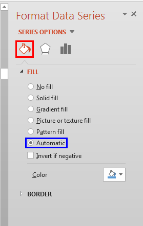
Figure 2: Format Data Series option selected - Doing so brings up the Format Data Series Task Pane that you see in Figure 3, below. Make sure that the Fill & Line button is active, as shown highlighted in red within Figure 3, below. Then, select the Fill option. You can see that the default Fill type is Automatic, which is indicated by the selected status of radio button in front of it, as shown highlighted in blue within Figure 3.

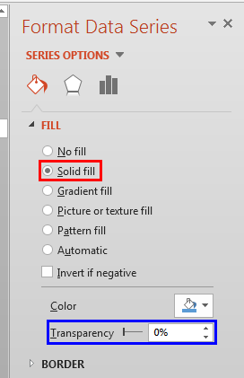
Figure 3: Format Data Series Task Pane - As you can see in Figure 3, above, there is no Transparency slider within the Format Data Series Task Pane. This is because the fill color is set to Automatic, as shown highlighted in blue within Figure 3, above. To change the fill transparency, click on the Solid fill radio button, as shown highlighted in red within Figure 4, below. Doing so brings up the Transparency slider, as shown highlighted in blue within Figure 4.

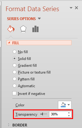
Figure 4: Transparency slider now visible - Now set a transparency value as required. We set the transparency to 30%, as shown highlighted in red within Figure 5, below.

Figure 5: Data Series transparency set to 30% Transparency for Columns without Solid Fills?
- We explain transparency for solid fills in this tutorial. However if your 3D column is filled with a gradient, a picture, or some other shape fill, you can still change the transparency for that fill type. Refer to our Transparency for Shape Fills in PowerPoint 2013 for Windows tutorial. Even though that tutorial is about shape fills, the same techniques work for Data Series fills within charts.
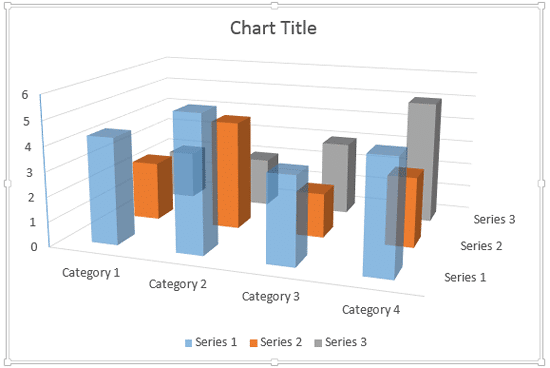
- Doing so makes the selected series semi-transparent as shown in Figure 6, below.

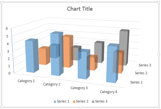
Figure 6: Columns of Series 1 made semi-transparent - Similarly, you can change the transparency of columns representing other series. In Figure 7, below you can see that we have changed the transparency of Series 1 and 2 so that all columns partially hidden behind them are also visible.

Figure 7: Reducing the fill opacity of columns has made the hidden chart elements visible - Compare charts in Figures 7 and 1. You can see that in Figure 7 the columns of Series 3 which were partially hidden earlier, are visible through the semi-transparent columns.
- Save your presentation often.
