We look at ideas to find inspiration to create better charts. This entire series is also available in the form of an ebook.
Author: Geetesh Bajaj
Product/Version: PowerPoint
OS: Microsoft Windows and Mac OS X
Have you ever noticed how charts can all start to look the same after a while? It's easy for someone to dismiss them as uninspiring, but we believe there's always room for improvement. To create more engaging and motivating charts, it's important to first find inspiration within yourself. Try thinking outside of the box and incorporate different colors or graphics that represent your data in unique ways. Additionally, seek inspiration from other sources such as industry experts or social media trends. By doing so, not only will you create more inspiring visuals, but you will set yourself apart from others in your field!
Finding inspiration can be a challenging task, but the good news is that it's all around you! Here are some ideas to help jumpstart your creativity and get those inspirational juices flowing. We encourage you to look at things from a new perspective and explore different environments and experiences. By broadening your horizons and stepping outside of your comfort zone, you may discover that the answers have been right in front of you all along. Here are some ideas that will get you inspired.
To begin with, explore financial statements, even if they are printed or within PDFs. These statements may contain great charting examples that can inspire you. You can find plenty of such financial statements from the downloads section of the websites belonging to banking and financial companies such as Citibank, McKinsey, etc., as shown in Figure 1, below.

Figure 1: Download reports online
Having said so, charts printed on financial statements mimic paper rather than slides and can thus afford to contain minute detail—something that’s not really in place within charts shown on a slide. Did that sound confusing? Let us share an analogy to understand this concept better.
Let's start with a business newspaper, where a sheet or two has listings of stocks along with their rates. This is something that can be compared to a sheet within Excel or another spreadsheet program.
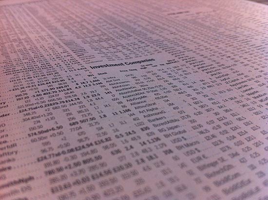
Figure 2: Stock market quotes in a newspaper mimic a spreadsheet?
Photo Credit: Andreas Poike by Creative Commons
Now, let us look at a report or even a legal agreement spanning pages. Such documents are intended to be printed. Often, they tend to use smaller font sizes and even detailed charts and other graphics. This is something that can be easily compared to a document created in Word or another word processing program.
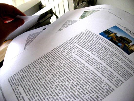
Figure 3: Printed documents created within a word processor
Photo Credit: Desi by Creative Commons
Now consider a slide created within PowerPoint or another slide program. A similar analogy for a slide could be a business card! Even though you may be mistaken for not realizing the benefit of this analogy when you see the slide projected on an entire wall, be assured that a slide should ideally include no more info than what you can see on a business card. That's all the comprehension power your audience has unless you are providing them with printed or PDF handouts, but those handouts are not your slides!

Figure 4: Slides are like business cards (or even bulletin boards)
Photo Credit: Woodley Wonder Works by Creative Commons
Based on this analogy, there's no reason why you cannot get inspired by financial reports, but you will have to adapt that inspiration to something that works well within the confines of a slide! This also means you must have no more than one chart on the slide, or at the most two. And even then, your charts must be clean.
Want more inspiration? You can find entire boards on sites such as Pinterest that contain charts of all types, as shown in Figure 5, below.
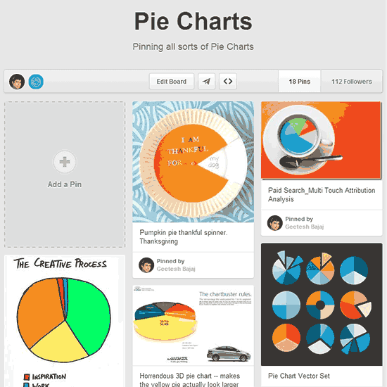
Figure 5: Pinterest provides so much inspiration
There's even more inspiration on national television, especially on the news and on business channels. Look at the charts they show, and you will discover that they are almost never too detailed since they are more akin to slides—just what you need!
Even more inspiration can be found in magazines and newspapers. We often cut out samples of great-looking charts and other graphics from newspapers and old magazines. We then paste them all into our chart scrapbooks. More often than not, we either scan or photograph our source content. If the content is within an online magazine or ebook, we use screen capture programs such as Snagit to create more source content. We then use PowerPoint slides to create a digital scrapbook. This sort of scrapbook makes an awesome inspiration bank.
Do you have your own inspiration idea? Do share with us by dropping a comment on this page!
10 15 05 - Ten Tips for Cool PowerPoint Charts: PowerPoint Chart Tips 04: Inspiration is Not Afar (Glossary Page)
You May Also Like: Possibilities 01: Static PowerPoint vs. Dynamic PowerPoint | Banana PowerPoint Templates



Microsoft and the Office logo are trademarks or registered trademarks of Microsoft Corporation in the United States and/or other countries.