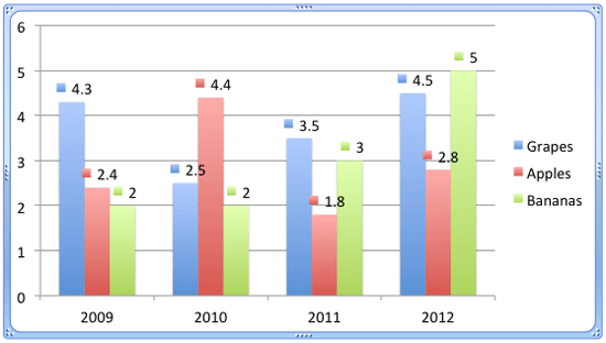
Adding data labels to your charts in PowerPoint is one of the ways in which you can make them more effective and relevant to your audience. Using options within the Format Data Labels dialog box, you can further format data labels to suit your requirements, as explained in this tutorial.
To begin, you need a chart on your slide. If you don't have one, insert a chart on your slide. Thereafter, enable data labels for your chart.
Follow these steps to change the appearance of data labels in PowerPoint 2011 for Mac:
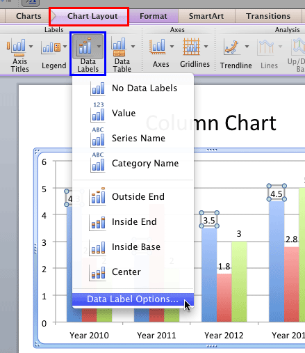
- Select the chart. Doing so displays the Chart Layout and Format tabs on the Ribbon area. Select the Chart Layout tab, as shown highlighted in red within Figure 1, below. Within the Chart Layout tab, click the Data Labels button, highlighted in blue within Figure 1, to open the Data Labels menu. Within the Data Labels menu, select Data Label Options, as shown in Figure 1.

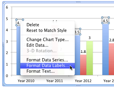
Figure 1: Data Label Options - Alternatively, select data labels of any data series in your chart and right-click (Ctrl+click) to bring up a contextual menu, as shown in Figure 2, below. From this menu, choose the Format Data Labels option, as shown in Figure 2.

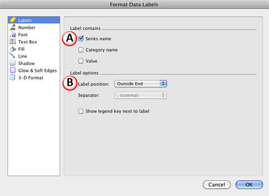
Figure 2: Format Data Labels option - Either of the above options will summon the Format Data Labels dialog box as shown in Figure 3, below. Make sure that the Labels tab is selected within the sidebar.

Figure 3: Format Data Labels dialog box - As you can see in Figure 3 above, the Labels tab of Format Data Labels dialog box includes two sections, which we have marked as A and B within Figure 3. Let us explore options within these sections:
A. Label contains section includes three check-boxes
Series name
- Displays name of the series as data labels.
Category name
- Displays name of the categories as data labels.
Value
- Displays values of series as data labels.
- Select check-boxes depending upon what you want to show as the data label. You can select any one, two or all three check-boxes, as required. However, it's always best to select any one of these options so that your chart does not look too crowded, unless you have a compelling reason to choose otherwise.
B. Label options section contains three options
Label position
- These are the same options that you can see in the upper half of the Data Labels menu, shown in Figure 1, previously on this page. These options decide the positioning of data labels. Refer to our Chart Data Labels in PowerPoint 2011 for Mac tutorial to learn more about these options.
Separator
- This option is grayed out unless you select more than one check-box within Label contains section (refer to point A, above). This option allows you to choose a parameter to separate elements within the data label. You can select a coma, a semi colon, a colon, a dot, or a space to separate them.
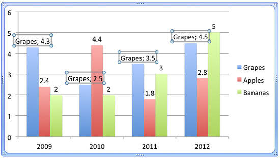
- Figure 4, below, shows our sample chart with data labels of the Grapes series displaying value as well as the series name, separated with a semi colon.

Figure 4: Series name and value separated with a semi colon Show legend key next to label
- Select this check-box if you want to show the legend key (the color block) in front of the data label. Figure 5, below, shows legend keys as a part of data labels for all data series in the chart.

Figure 5: Legend keys shown as a part of the data labels - Select options and format your data labels as required. When done, click the OK button within the Format Data Labels dialog box to get back to your slide.
- Similarly, select other data labels within your data series and format them one by one.
- Save your presentation.
