When you create charts within PowerPoint, typically the Chart Area doesn't show any fill or any kind of formatting. The exception to this rule is if you have applied a particular Chart Style. Thus in most scenarios, the Chart Area is completely transparent with no fill or outline attributes. This default status works well most of the time because the Chart Area is the backdrop area, and all chart elements are placed over it—so the lack of any formatting makes things simpler. However, if your slide background is crowded, then the Chart Area's transparency can pose a problem. To counter this issue, you can fill the Chart Area with a solid color, a gradient or even a pattern to add some visual separation from the slide's background.
Follow these steps to explore more in PowerPoint 2013 for Windows:
- Select the chart that you want to format the Chart Area for. If you don't have a chart, insert a new chart in your slide.
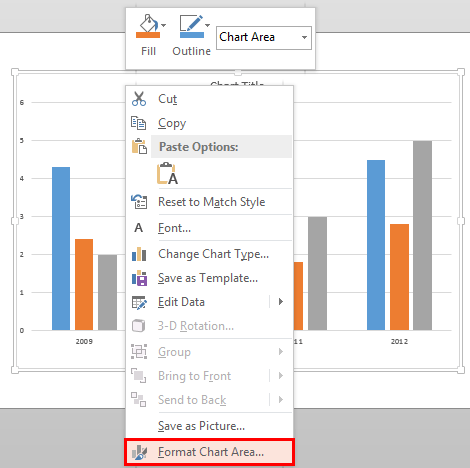
- Now, carefully right-click the Chart Area. From the resultant menu, select the Format Chart Area option, highlighted in red within Figure 1.

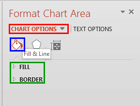
Figure 1: Format Chart Area option - Doing so opens the Format Chart Area Task Pane as shown in Figure 2. In this Task Pane, make sure that the Chart Options tab is selected (highlighted in red within Figure 2). Then click the Fill & Line button (highlighted in blue within Figure 2).

Figure 2: Format Chart Area Task Pane - Here you will find the Fill and Border options for the chart area (highlighted in green within Figure 2):
- Fill: Includes various options that are used to edit the fill of the Chart Area.
- Border: Includes various options that are used to edit the border or outline of the Chart Area.
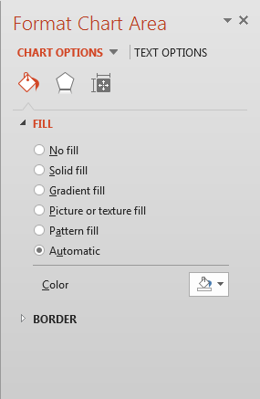
- Click the Fill option to access all options within this section, as shown in Figure 3.

Figure 3: Fill options for the Chart Area. - Let us explore all of the Fill options that you see in Figure 3. Do note that some of these options listed below link to further tutorials with more detail. Although the linked tutorials pertain to shapes, the same principles hold good for fills related to the Chart Area.
No fill
- Choose this option to remove any fill from the selected Chart Area.
Solid fill
- This option is used to fill the selected Chart Area with some solid color fill. You can use any of the Theme colors, Standard colors, or any other color of your choice. To learn more about this option, read our Add Solid Fills to Shapes in PowerPoint 2013 tutorial.
Gradient fill
- With this option, you can apply a gradient as a fill for the Chart Area. A gradient is a blend of two or more colors merging into each other. Learn more in our Add Gradient Fills to Shapes in PowerPoint 2013 tutorial.
Picture or texture fill
- This option allows to use either a picture or a texture as a fill for the Chart Area. Our Add Picture Fills to Shapes in PowerPoint 2013 and Add Texture Fills to Shapes in PowerPoint 2013 tutorials can provide you with more information on this option.
Pattern fill
- Choose from 48 different patterns contained within PowerPoint. More info can be found in our Add Pattern Fills to Shapes in PowerPoint 2013 tutorial.
Automatic
- Selecting this option gets back the automatic fill of the Chart Area. This option is helpful especially when you have applied a Chart Style to your chart. It cancels any fill that you might have applied manually, and restores the default fill used by the applied Chart Style.
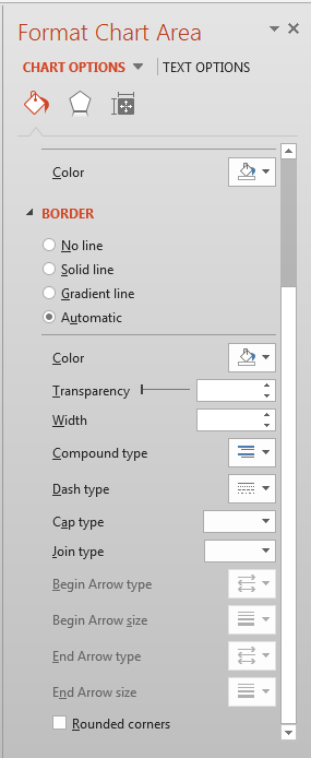
- Now click on the Border option to access all options within, as shown in Figure 4.

Figure 4: Border options for the Chart Area - Let us explore all of the Border options, that you see in Figure 4. Again, do note that some of these options listed below link to further tutorials with more detail. Although the linked tutorials pertain to shapes, the same principles hold good for lines related to the Chart Area.
No line
- Choose this option to remove any outline from the selected Chart Area.
Solid line
- This option is used to apply a solid color border to the selected Chart Area. You can use any of the Theme colors, Standard colors, or any other color of your choice. To learn more about this option, read our Formatting Lines (and Shape Outlines) in PowerPoint 2013 tutorial.
Gradient line
- This option applies a gradient border to the Chart Area. A gradient is a blend of two or more colors merging into each other. Learn more in our Gradient Outlines in PowerPoint 2013 tutorial.
Automatic
- Selecting this option gets back the automatic border style of the Chart Area. This option is helpful especially when you have applied a Chart Style to your chart. It cancels any border style that you might have applied manually, and restores the default border used by the applied Chart Style.
- When you select any of the Border options other than No line, you will also be provided with various line editing options such as:
Transparency
- Used to set the transparency value for the border of the selected Chart Area.
Width
- Adds a weight for the selected line in points. To learn more about this option, read our Formatting Outlines for Shapes in PowerPoint 2013 -- Weight tutorial.
Compound type
- Selecting this option reveals a drop-down menu from where you can choose any of the compound types available for outlines. Note that compound lines in PowerPoint are limited to two or three lines compounded to each other.
Dash type
- This option allows you to apply dash attribute to the border of the Chart Area. Learn more about Formatting Outlines for Shapes in PowerPoint 2013 -- Dash tutorial.
Cap type
- This allows you to choose between a Square, Round, or Flat line end type.
Joint type
- This allows you to choose between Round, Bevel, and Miter joints.
Rounded corners
- Selecting this check-box causes the corners of the Chart Area border to be rounded in shape.
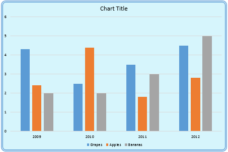
- Select the required options and format the Chart Area as required. In Figure 5, you can see that our sample chart with formatted Chart Area includes a solid fill, and also has an outline (compare with the partial chart in Figure 1).

Figure 5: Chart Area applied with fill and border - Save your presentation often.
