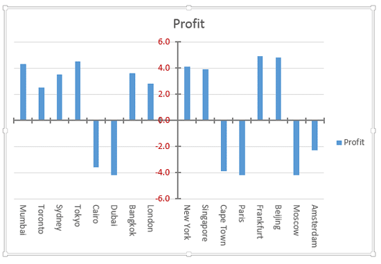
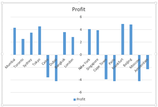
In a PowerPoint column chart, axes are typically positioned on the left and bottom of the plot area. However, there may be scenarios where your chart axes cross each other within the plot area rather than be located on its edges, as shown in Figure 1, below.

Figure 1: Chart with crossed axes
Attaining such a crossed axes can be desirable due to a variety of reasons in both the value and category axes:
For Value axes
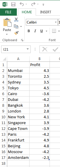
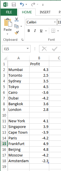
With a value axis, you may see this behavior when you have both positive and negative values, as is the case with the data represented in Figure 1, above. Retaining your axis at the zero level may be desirable so that negative values show below the axis, and positive values are placed above. Fortunately, you do not have to do anything to cross the value axis in such a scenario since crossing for a chart that has both positive and negative values is the default behavior. Look at the source data shown in Figure 2, note that it has both positive and negative values.

Figure 2: Data with both positive and negative values
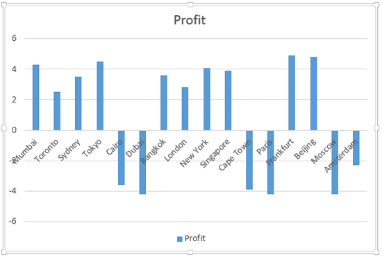
If the data shown in Figure 2, above is used to create a column chart, then PowerPoint will automatically create a chart with a crossed value axis at the zero value point, as shown in Figure 3, below.

Figure 3: Value axis is crossed at the zero value point
However, you are not limited to retaining the crossing position of the axis at zero. There's no reason why it cannot be -2 or +2, or wherever you want. Later in this tutorial, we will show you how you can alter the position where this axis is crossed.
For Category Axes
On the other hand, the reason to end up with a crossed axis for the category axis differs. You may want a crossed category axis if you have too many categories, as already shown in Figure 3, above, where we have 16 categories. In such a scenario, a leftmost placed axis may not help you ascertain column representation at the far right. Placing the axis in the center (refer to Figure 1, shown earlier on this page) may provide a better solution.
Follow these steps to learn how to add crossed axes and to change the position where they cross in PowerPoint 2013 for Windows:
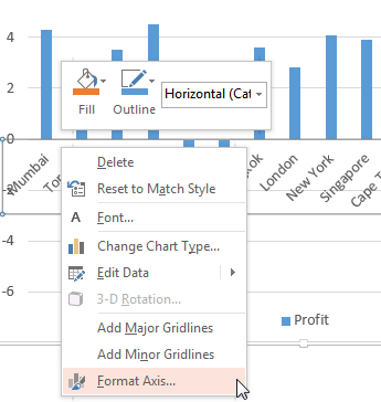
- Let us begin with the category axis. Select the category axis, and right-click to bring up the contextual menu that you see in Figure 4, below. Choose the Format Axis option. If you do not see the Format Axis option in the contextual menu, you may have right-clicked on another chart element. Make sure you then deselect everything in the chart, and then right-click on the category axis.

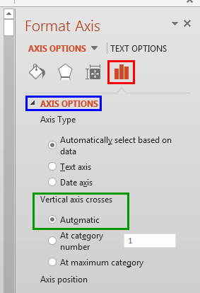
Figure 4: Format Axis option selected - Doing so opens the Format Axis Task Pane that you see in Figure 5, below. Make sure that the Axis Options button is chosen, as shown highlighted in red within Figure 5. Then, select Axis Options, highlighted in blue within Figure 5. Note that the Vertical axis crosses option is set to Automatic, as shown highlighted in green within Figure 5.

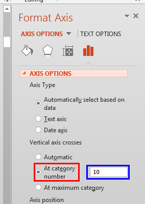
Figure 5: Default position where the vertical axis crosses the horizontal axis - Select the At category number radio button, as shown highlighted in red within Figure 6, below, and type the category number before which the axis should move to. We typed 10 for our sample data, highlighted in blue within Figure 6, below.

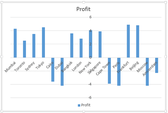
Figure 6: Value axis crossing category axis before 10th category - The resultant chart can be seen in Figure 7, below where the axis now shows between the 9th and the 10th category. This solution brings forth a problem of its own. The Axis Labels now overlap one of the columns, as shown in Figure 7.

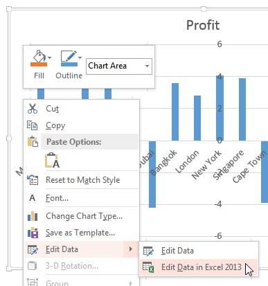
Figure 7: Value axes labels overlapping one of the columns - To solve this problem, select and right-click any chart element and within the resultant contextual menu, choose the Edit Data option as shown in Figure 8, below. This opens a sub-menu, where you must select the Edit Data in Excel 2013 option (refer to Figure 8 again).

Figure 8: Select the Edit Data in Excel 2013 option - Doing so brings up the same data that we last saw in Figure 2, earlier on this page. We will now insert a blank row after the 9th row, as shown in Figure 9, below.

Figure 9: Blank row added within the Excel data sheet - The resultant chart is so much clearer. Notice the empty area that displays your category axis labels so well in Figure 10, below. Do compare with Figure 7 to see this difference!

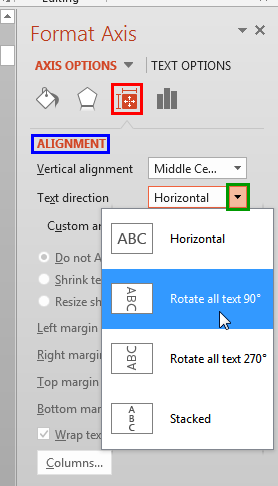
Figure 10: A cleaner crossed axis - At this point, you can optionally rotate category axis labels to make sure that they don't overlap any of the value axis labels. To do so, access the Format Axis Task Pane as explained in Step 1, earlier on this page. Within the Format Axis Task Pane, make sure that the Size & Properties button is selected as shown highlighted in red within Figure 11, below. Then, select the Alignment option, highlighted in blue within Figure 11. Thereafter, click the down-arrow, highlighted in green within Figure 11, provided with the Text direction option. From the resultant menu, choose the Rotate all text 90° option, as shown in Figure 11.

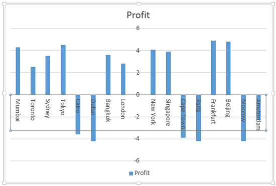
Figure 11: Select the Rotate all text 90° option - In Figure 12, you can see the category axis labels rotated to 90°.

Figure 12: Category axis labels rotated to 90° - Now, let us consider the value axis. Notice that by default, the value axis is crossed by the category axis at the zero level (see Figure 12, above) with negative values below the axis, and positive ones above. Ideally, this is exactly how this should be. So, the only reason we are showing you how to change this crossed location is so that you can be aware of how to manually make this change. Select the value axis, and right-click to bring up the same contextual menu you saw in Figure 4, earlier on this page. Choose the Format Axis option (refer to Figure 4 again).
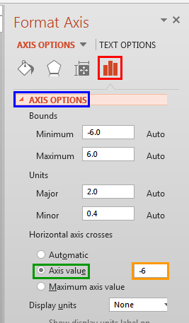
- This step brings up the Format Axis dialog box as shown in Figure 13, below. Within the Format Axis Task Pane, make sure that the Axis Options button is selected, as shown highlighted in red within Figure 13. Then, select Axis Options, highlighted in blue within Figure 13. Thereafter, select the Axis value radio button, highlighted in green within Figure 13 and change the value to the point where you want the value axis to be crossed by the category axis. We changed the value to -6 as shown highlighted in orange within Figure 13.

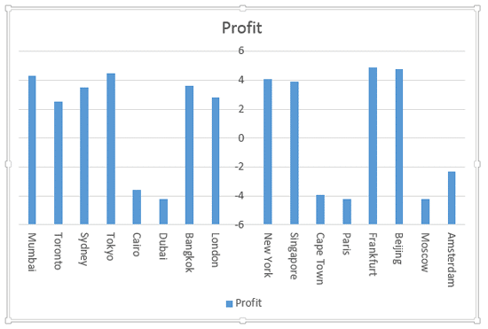
Figure 13: Change the position where the horizontal axis crosses the vertical axis - Doing so will move the category axis down so that it crosses the value axis at -6, as you can see in Figure 14, below.

Figure 14: Category axis crosses the value axis at -6 - Save your presentation often.
