The third type within the Group Cards category in
Sway is the Comparison Group Card. Like the
Stack Group Card, the Comparison Group Card can also only contain
Picture Cards. Further, you are limited to just two Picture Cards. After all, it would
be difficult to compare more than two Cards!

Follow these steps to see how the Comparison Group Card works:
- Create a new Sway or open an existing one. Then access the All Cards
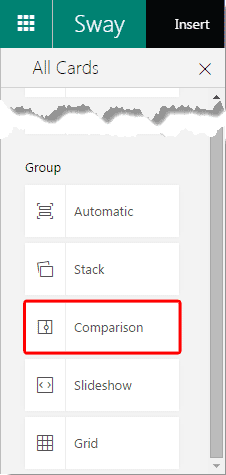
pane and select the Group category, as shown in Figure 1, below.

Figure 1: Group Cards within All Cards pane
Note: Is the All Cards pane, as shown in Figure 1 not visible? Then click the
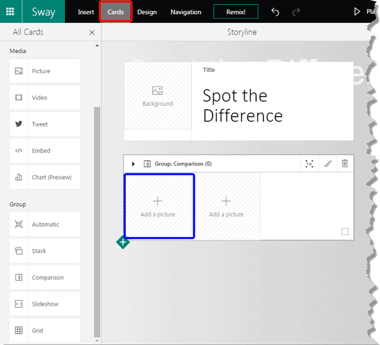
Cards option in the menu bar as shown highlighted in red within Figure 2,
later on this page.
- Then choose the Comparison option, highlighted in red within Figure 1.
This will place a new Group Card in your Storyline with a Comparison Group layout, as
shown in Figure 2, below.

Figure 2: Comparison Group Card added- Click the Add a Picture box, highlighted in blue within Figure 2, above.
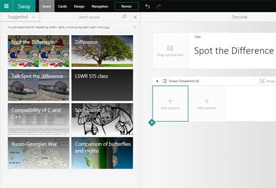
This will show the Insert pane, as can be seen in Figure 3, below. Options within the Insert pane are
explained in our Insert Options in Sway tutorial.

Figure 3: Insert pane- We added two Picture Cards within the Comparison Group Card, as you can see in
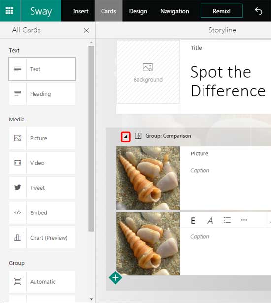
Figure 4, below. Do both the pictures look similar? Actually, there are a few small differences between them, and we shall
explore these differences later!

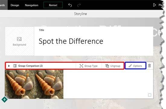
Figure 4: Picture Cards in our Comparison Group Card- The moment you click on the Group handle on the top (highlighted in red within Figure 4,
above), you will find that your Group Card collapses, as shown in Figure 5, below.

Figure 5: Comparison Group created- You will also notice that several options are available in the area now. The options in the area highlighted in
red within Figure 5 are explained in Step 5 on our
Automatic Group Cards in Sway tutorial page. And the area highlighted in
blue within Figure 5 is explained in Step 4 on our
Picture Cards in Sway tutorial page.
Delete
- The last button on the right will delete the entire Group Card with all its contents!
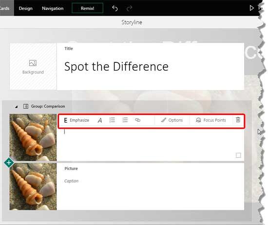
- Within the individual Cards contained in the Group, you can do everything you can do with regular
Picture Cards, as shown in Figure 6, below. You will notice that this
Card sports all the options (area highlighted in red) that are available within a regular
Picture Card.

Figure 6: Picture Card within the Group Card- When individual Picture Cards are added, Sway automatically sets
Focus Point for the pictures, resulting in pictures that are cropped, as shown in Figure 7, below.

Figure 7: Cropped pictures in Preview pane- You can overcome this problem by following steps within our
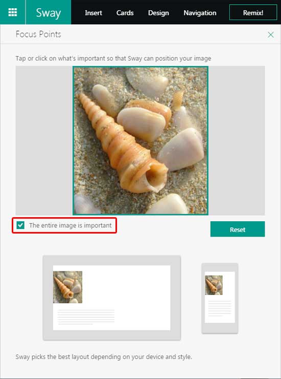
Focus Point for Pictures within Sway tutorial. In the Focus Points overlaid
pane, you will need to select the check-box that says The entire image is important, as shown highlighted in
red within Figure 8. This will prevent important areas of pictures being cropped out.

Figure 8: Focus Points overlaid pane
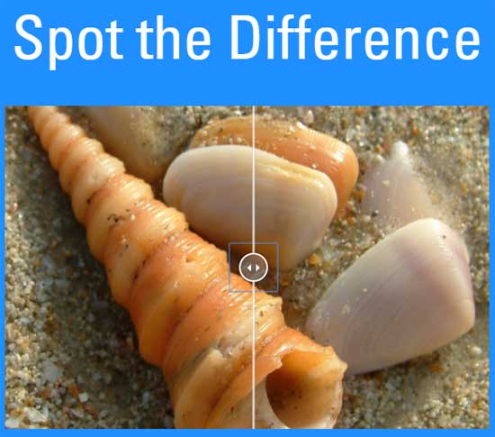
You can see how the Comparison Group Card works within the embed below. Make sure you drag the divider slider in between. How many
differences were you able to spot between the two pictures?

