Learn about column charts, and how you can use them within PowerPoint. We also look at several subset types of column charts.
Author: Geetesh Bajaj
Product/Version: PowerPoint
OS: Microsoft Windows and Mac OS X

A column chart is probably the most simple chart type that you can create in PowerPoint. What makes a column chart the most preferred chart type is that it follows human thinking. We are all used to identifying a taller column as representing more success, more sales, more profits, more reach, etc. And column charts fit in perfectly with such human thinking! It’s no wonder that they are so popular.
Well, the answer is both yes and no.
Yes because in the real world, bar and column charts are names that are used interchangeably. In fact, most of the time, when your boss or client asks for a bar chart, they may mean column chart.
The answer could be no when you are working in the PowerPoint interface because in PowerPoint parlance, standing bar charts are column charts, and sleeping bar charts are what it calls bar charts!
Like bar or line charts, column charts also work best to compare values over a period of time such as days, weeks, months, quarters, or years. Of course, you can also use column charts to categorize more than just time, because the categories you choose are entirely for you to decide!
In the sample column chart that you can see in Figure 1, below you will notice that this period of time typically shows up within the X-axis, which is also called the Category axis because it represents categories. The categories in this case are the successive years, highlighted in purple within Figure 1, below.
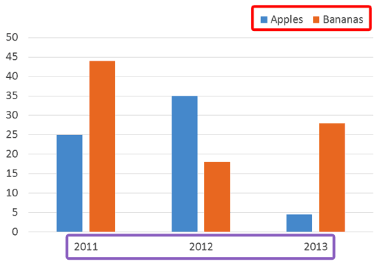
Figure 1: Column Chart sample
The same categories can also be found within the data used to create this column chart, as shown in Figure 2, below. Note that the years can be seen in the purple shaded areas within Figure 2, below.
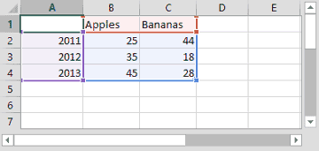
Figure 2: Data used for the Column Chart
Similarly, the areas shown in red within Figure 2, above, correspond to the series within the data. In the case of our sample data, these are the fruits. Our series names are Apples, and Bananas. Within the chart, the series shows up as the legend, as highlighted in red within Figure 1, earlier on this page.
Column charts are useful for showing data changes over a period of time or for illustrating comparisons among items.
In column charts, categories are typically organized along the horizontal axis and values along the vertical axis.
You can have column charts that have one series, one category, or multiple series and categories.
To see a sample presentation containing column chart types and subtypes, scroll down to the bottom of this page.
Column charts have the following sub-types within PowerPoint. Do note that all these sub-types are not available in all PowerPoint versions:
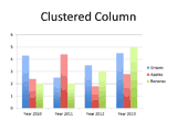
A clustered column chart compares values across categories and displays values in vertical rectangles.
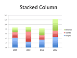
Stacked column charts show the relationship of individual items to the whole, comparing the contribution of each value to a total across categories and displays values in vertical stacked rectangles.
100% stacked column charts compare the percentage that each value contributes to a total across categories displaying values in vertical 100% stacked rectangles.

A clustered column in 3-D displays the data by using a 3-D perspective only. A third value axis (depth axis) is not used.
The clustered column chart can be used when you have categories that represent:
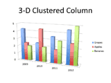
This chart type displays the data by using a 3-D perspective only. A third value axis (depth axis) is not used.
The stacked column chart can be used when you have categories that represent:
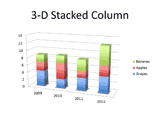
The 3-D 100% stacked column chart displays the data by using a 3-D perspective only the third value axis (depth axis) is not used.
The 100 % stacked column chart can be used when you have categories that represent:
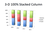
3-D column charts use three axes that you can modify (a horizontal axis, a vertical axis, and a depth axis), and they compare data points (data points: Individual values plotted in a chart and represented by bars, columns, lines, pie or doughnut slices, dots, and various other shapes called data markers. Data markers of the same color constitute a data series.) along the horizontal and the depth axes.
3-D column chart can be used when you want to:
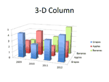
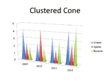
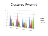
The Cylinder, Cone, and Pyramid charts are available in the same Clustered, Stacked, 100% Stacked, and 3-D chart types that are provided for rectangular column charts, and they show and compare data the same way. The only difference is that these chart types display cylinder, cone, and pyramid shapes instead of rectangles.

Click below to view on SlideShare
Click below to view on YouTube
PowerPoint Chart Types: Column Charts in PowerPoint (Glossary Page)
You May Also Like: Long Story Short: Conversation with Margot Leitman | Banana PowerPoint Templates


Microsoft and the Office logo are trademarks or registered trademarks of Microsoft Corporation in the United States and/or other countries.