Learn about chart elements in PowerPoint 2013 for Windows. These chart elements include Series, Categories, Axes, Plot area, Legend, Chart Title, and many more.
Author: Geetesh Bajaj
Product/Version: PowerPoint 2013 for Windows
OS: Microsoft Windows 7 and higher
Although a chart may seem like a single object at first glance, look closer and you will find that each chart comprises several individual elements that we call chart elements in PowerPoint. These chart elements include:
In this tutorial, we'll learn about these individual PowerPoint chart elements and also how to select and edit them. Before starting, we are assuming you already have a chart inserted on your PowerPoint slide. If not, refer to our Inserting Charts in PowerPoint 2013 tutorial and insert a chart on your slide.
Different Chart types contain distinctly recognizable Chart Elements. In Figure 1 below, you can see a Column chart in PowerPoint 2013, which contains some of the most common Chart Elements found in almost all chart types:
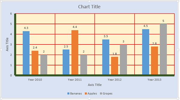
Figure 1: Column Chart selected on the slide
Let us explore various Chart Elements:
This is the area covered by entire chart which is populated by various other chart elements (colored in pale blue within Figure 1, above). Consider this as the layer of your chart that's placed right at the back.
The area within the axes is knows as plot area (colored in pale yellow within Figure 1, above). The plot area includes the series, gridlines, etc. And the legend and titles are normally placed outside the plot area.
There are two types of titles:
Most of the charts have two axes (colored in green within Figure 1, above):
Some charts may also have a Z axis. Learn more about PowerPoint's chart axes.
Most of the time, you may see horizontal gridlines but vertical gridlines are also available as shown in Figure 1 above, where they have been colored in red. Both of them can be formatted as required.
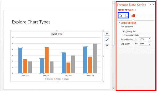
Every column of data within the data sheet that's shown as a component of the chart is known as a Series. In Figure 1 above, there are three Series named Bananas, Apples, and Grapes.
A set of Series can be represented as a Category. The chart in Figure 1, above contains four Categories named Year 2010, Year 2011, Year 2012, and Year 2013.
These are the individual figures that identify each series. The font and placement for these can be formatted. In Figure 1 above, they are placed on top of the Series.
This is a box placed normally outside the plot area which provides captions (and/or color coding) to the series, and helps identifying the series by their colors. Legends are automatically created with the chart itself, although you can opt to remove the legend. In Figure 1 above, you can see them placed at the bottom of the chart.
This is an optional chart element which displays the data values in the form of a table right below the chart. Learn more about Data Table in our Chart Data Table in PowerPoint 2013 for Windows.
Getting into datasheet mode in PowerPoint 2013 translates to launching a Data Sheet with your data available to edit, add, remove, etc. This Data Sheet contains the values based on which the chart is created.
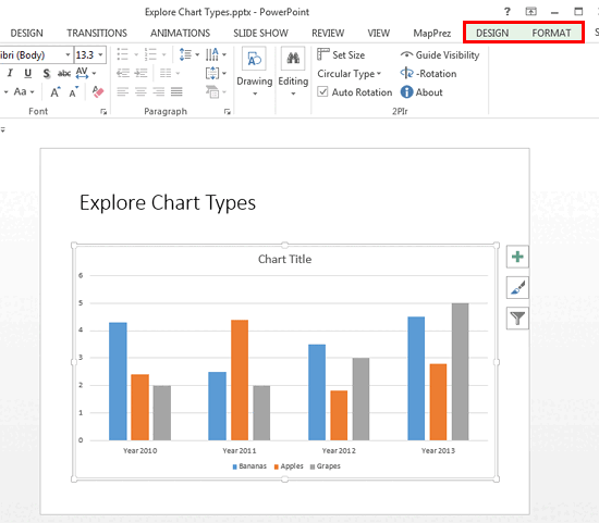
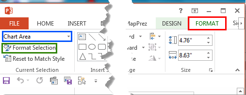
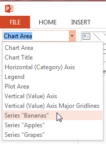
Follow these steps to learn how to select individual chart elements and edit them in PowerPoint 2013:
See Also:
Chart Basics: Chart Elements (Glossary Page)
Chart Elements in PowerPoint 2011 for Mac
Chart Elements in PowerPoint 2010 for Windows
Chart Elements in PowerPoint 2007 for Windows
Chart Elements in PowerPoint 2003 and 2002 for Windows
You May Also Like: Overcoming the Challenges of Staying Connected | Designs PowerPoint Templates


Microsoft and the Office logo are trademarks or registered trademarks of Microsoft Corporation in the United States and/or other countries.