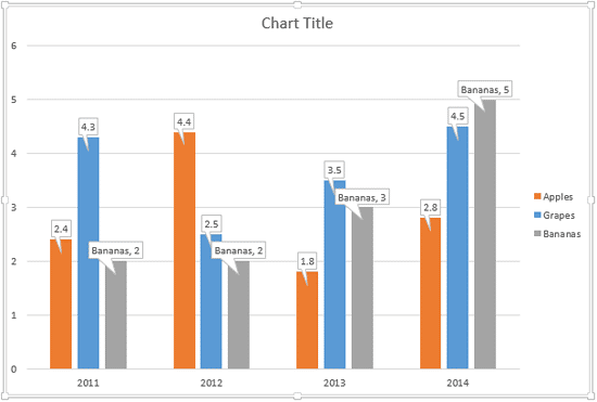
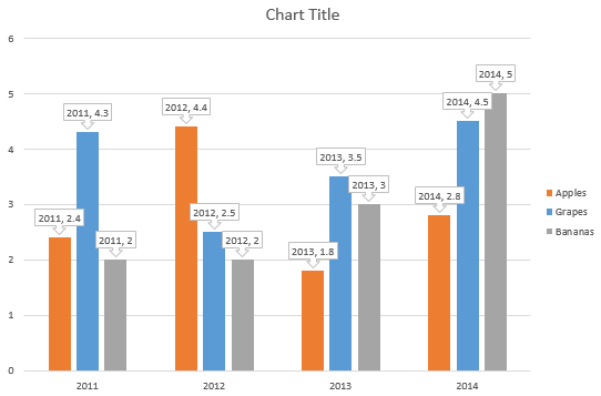
In PowerPoint 2013 for Windows, there is a new option called Data Callouts that allows you to place your Data Labels within the callout shapes. The default data callouts are simple rectangular callout shapes, as you can see in Figure 1, below.

Figure 1: Data Callouts added to the chart
Beyond these simple rectangular callouts, PowerPoint 2013 for Windows provides you with various other shapes to make your data labels stand apart.
Let us explore how we can change callout shapes for data labels in PowerPoint 2013 for Windows:
- Open your presentation and navigate to the slide containing the chart, to which you have added data callouts.
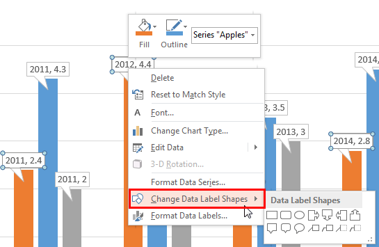
- Select the data callout for a series, and right-click to bring up a contextual menu, as shown in Figure 2, below. Within this contextual menu, select the Change Data Label Shapes option as shown highlighted in red within Figure 2. This action opens a sub-menu named Data Label Shapes (refer to Figure 2 again).

Figure 2: Change Data Label Shapes option Note: The
Chart Tools,
Design and
Format tab is a
contextual tabs. These tabs are special tabs in the
Ribbon that are not visible all the time. They only make an appearance when you are working with a particular slide object which can be edited using special options.
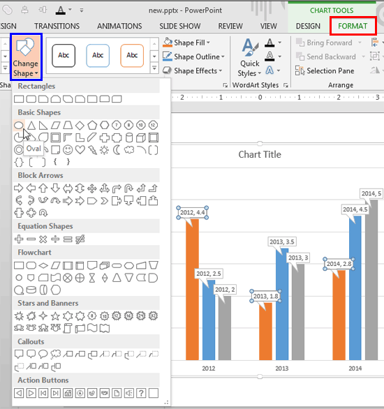
- Alternatively, with the data callout selected, access the Chart Tools Format tab of the Ribbon, as shown highlighted in red within Figure 3, below . Then, click the Change Shape button highlighted in blue within Figure 3. Doing so opens Change Shape drop-down gallery, as shown in Figure 3, below.

Figure 3: Change Shape drop-down gallery - Notice that whether you right-click a data callout, or even if you click the Change Shape button, you'll end bringing up the Shapes gallery. However, there is a difference because the former option only provides the shapes within the Callouts category. The latter option on the other hand lets you choose any type of shape that PowerPoint's Shapes gallery provides.
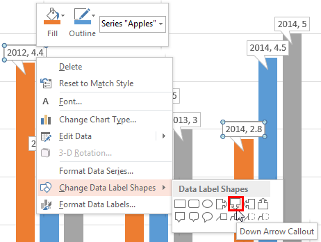
- If you choose the right-click option, the Data Label Shapes sub-menu appears (refer to Figure 2, shown previously on this page), containing 14 different shapes for your data labels. You need to click on the callout shape of your choice to select. In Figure 4 below, you can see the Down Arrow Callout shape being clicked upon, as shown highlighted in red within Figure 4.

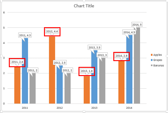
Figure 4: Down Arrow Callout shape being selected - This action will change the callout shape of the selected data series to Down Arrow Callout, as shown highlighted in red within Figure 5, below.

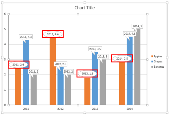
Figure 5: Callout shape of the selected data series changed to Down Arrow Callout - If you choose to bring up the entire Change Shape drop-down gallery, you can click upon any shape that you want to use as a container for your data labels, even if it is not within the Callouts category. In Figure 3 as shown previously on this page, you can see the Oval shape being clicked upon. This will change the callout shape of the selected data series to the selected shape, as shown highlighted in red within Figure 6, below.

Figure 6: Data Callouts are changed to ovals - Between right-clicking and accessing the Change Shape drop-down gallery, you can choose the option that works best for you. Either way, you can change the callout shape for the other data series, as shown in Figure 7, below.

Figure 7: Data Callout shape changed for all data series within the chart - Save your presentation often.
