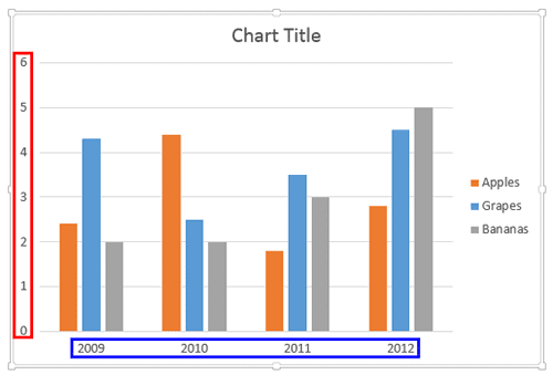
Axis labels are like captions for categories and values on chart axes. Look at Figure 1, below that shows the default position of axis labels for a column chart. Category names, which show as labels on the horizontal (category) axis have been highlighted in blue. Similarly, values show as labels on the vertical (values) axis, and these are highlighted in red within Figure 1.

Figure 1: Default axis labels in a column chart
Note: Axis labels are entirely different from
Axis titles.
So, where do these labels come from? Category axis labels (highlighted in blue, within Figure 1, above) reflect category names within your data (typically within the built-in Excel sheet). Values (highlighted in red, within Figure 1, above) on the other hand are determined by PowerPoint based upon the maximum value in your data, and the minimum value is always set to zero. Of course you can change the minimum and maximum values if you want.
Value Formats
Values are typically shown as numbers or percentage values. They can also have decimals.
Before you begin, you should have a chart inserted in your PowerPoint slide. We used a column chart for this example. Follow these steps to learn how you can change your axis labels in PowerPoint 2013 for Windows.
Changing Vertical (Value) Axis Labels:
Let's start with changing vertical (value) axis labels:
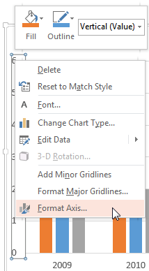
- Select the value axis of the chart on your slide and carefully right-click to access the contextual menu as shown in Figure 2, below. Within this contextual menu, choose the Format Axis option (refer to Figure 2 again). If you do not get the Format Axis option in the contextual menu, you may have right-clicked on another chart element. Make sure you then deselect everything in the chart, and then carefully right-click on the value axis.

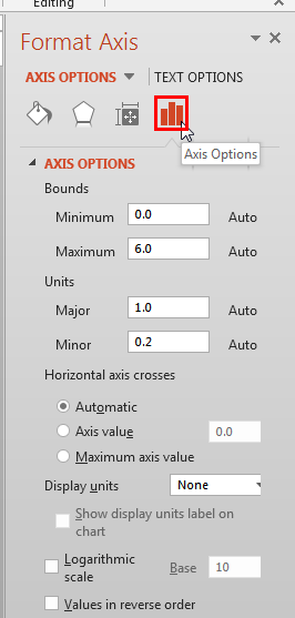
Figure 2: Format Axis option selected for the value axis - This step opens the Format Axis Task Pane, as shown in Figure 3, below. Make sure that the Axis Options button is selected as shown highlighted in red within Figure 3.

Figure 3: Format Axis Task Pane - In Figure 3 above, you can see that all vertical axis' Minimum, Maximum, Major, and Minor options are set to default values. We know so because the text Auto appears next to these options. If you change the Maximum or Minimum value, or change the Major or Minor unit, you will see the vertical axis labels reflecting changes you made. To change any of these values, type the required value within the box provided with each of these options.
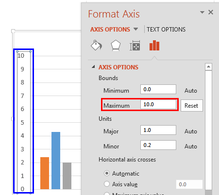
- Look at Figure 4, below where we have set the Maximum value to 10 as shown highlighted in red. You can see a live preview of the vertical axis label automatically reflecting this change, showing the Maximum value as 10 shown highlighted in blue within Figure 4. Compare this to the original chart shown in Figure 1, previously on this page. Also note within Figure 4 that the Auto option next to the Maximum value has now changed to Reset (compare Figures 3 and 4).

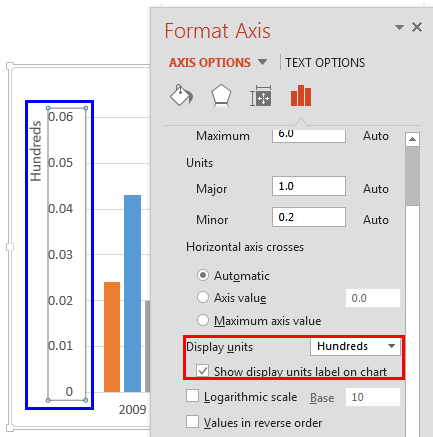
Figure 4: Value axis label reflecting the changed Maximum value - Now, look at Figure 5, below where we have changed the Display units to Hundreds as shown highlighted in red. Notice that the vertical axis label now shows the changed display units as shown highlighted in blue within Figure 5.

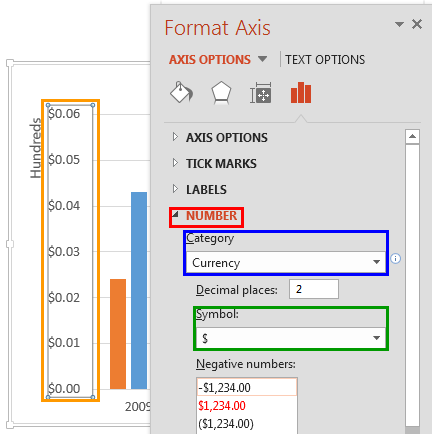
Figure 5: Value axis label reflecting the changed display units - You can also change the value axis label to show as Currency. To do so, select the Number option in the Format Axis Task Pane as shown highlighted in red within Figure 6, below. Thereafter, select Currency within the Category list shown highlighted in blue within Figure 6. You can also choose the Currency symbol you need as shown highlighted in green within Figure 6, and set the required number of decimal spaces. You can see that the resultant value axis label shown highlighted in orange within Figure 6 is now set to Currency.

Figure 6: Value axis label changed to Currency - You can similarly change value labels to show Percentages, Fractions, etc.
Changing Horizontal (Category) Axis Labels
Now, let us learn how to change category axis labels.
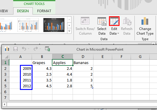
- First select your chart. Then, click the Edit Data button as shown highlighted in red within Figure 7,below, within the Charts Tools Design tab of the Ribbon. This opens an instance of Excel with your chart data. Notice the category names shown highlighted in blue.

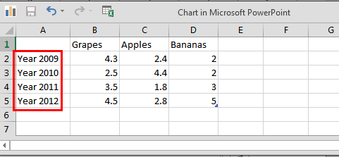
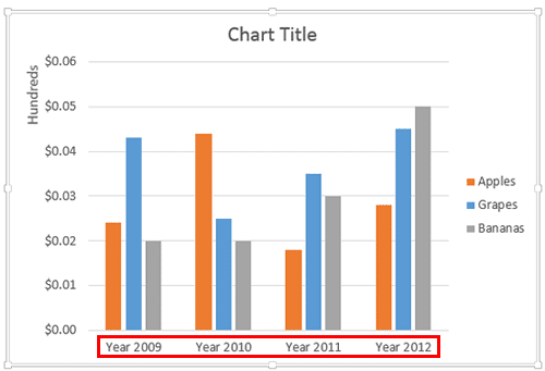
Figure 7: Edit Data button - To change category names within the instance of Excel sheet just type new names as required. Look at Figure 8, below where we have changed our category names as shown highlighted in red.

Figure 8: Category names changed within the Excel sheet - Close the instance of Excel. The changes you make to category names in Excel will automatically be reflected in the category axis labels on your chart within PowerPoint as shown highlighted in red within Figure 9. Compare this with the original chart shown in Figure 1, previously on this page.

Figure 9: Chart reflecting the changed category names - Save your presentation.
