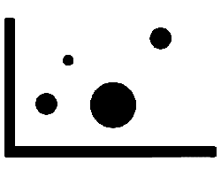
Learn about bubble charts, and how you can use them within PowerPoint. Although these charts have numbered values on both axes, they also include a third value, reflecting the bubble size.
Author: Geetesh Bajaj
Product/Version: PowerPoint
OS: Microsoft Windows and Mac OS X

In a bubble chart, data that is arranged in columns on a worksheet can be plotted, so that X values are sourced from the first column. The corresponding Y values and bubble size values are listed in adjacent columns of the data. This data can be collectively plotted in a bubble chart. Like XY (scatter) charts, bubble charts have numbered values on both axes, but they also include a third value, which reflects as the size of the bubbles.
Scroll down to the bottom of the page to see a sample presentation containing bubble chart types and subtypes:
Bubble charts have the following subtypes:
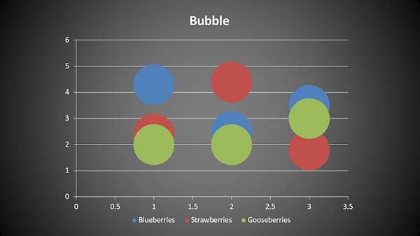
The bubble chart type compares sets of three values instead of two. The third value determines the size of the bubble marker, as shown in Figure 1, below.

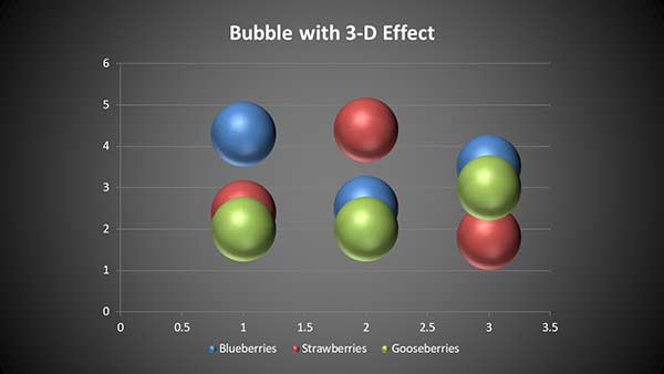
This chart works the same as a bubble chart. The only difference is the 3-D effect added to make the bubbles look more spherical, as shown in Figure 2, below.

Bubble Chart Type in PowerPoint Sample Presentation
Click below to view on SlideShare
Click below to view on YouTube
10 14 11 - PowerPoint Chart Types: Bubble Chart Type in PowerPoint (Glossary Page)
You May Also Like: Explore Fonts: Agency FB | Cakes PowerPoint Templates


Microsoft and the Office logo are trademarks or registered trademarks of Microsoft Corporation in the United States and/or other countries.