Learn about bar charts, and how you can use them within PowerPoint. We also look at several subset types of column charts.
Author: Geetesh Bajaj
Product/Version: PowerPoint
OS: Microsoft Windows and Mac OS X

A bar chart maps data using bars within a chart's plot area. A bar is essentially a rectangle that's typically thin width-wise and long length-wise. In simple terms, a bar chart is a column chart with columns rotated 90 degrees! ! Many chart designers define both column charts and bar charts as bar charts, but PowerPoint distinguishes between sleeping bars (bar charts) and standing bars (column charts).
Data that is arranged in columns or rows on a worksheet can be plotted in a bar chart. Bar charts illustrate comparisons among individual items. While bar charts do not possess the utter simplicity of column charts where a higher column indicates better results, they can be more suitable to present data in an almost timeline-like style.
Consider using bar charts when:
Figure 1, below shows a typical bar chart. This bar chart looks at the 10 top tea consuming countries worldwide with their per capita consumption of tea.
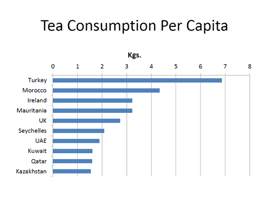
Figure 1: Bar Chart sample
Note that the categories within this chart are the countries. These can be found within the data used to create this bar chart, as shown in Figure 2, below. Note that the countries can be seen in the purple shaded area within Figure 2.
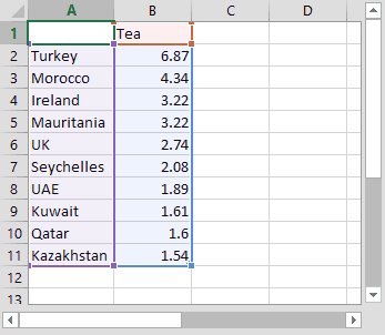
Figure 2: Data used to create sample Bar chart
Scroll down to the bottom of the page to see a sample presentation containing bar chart types and subtypes:
Bar charts have the following sub-types within PowerPoint. Do note that all these sub-types are not available in all PowerPoint versions:
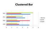
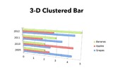
Cluster bar charts compare values across categories. The categories are organized along the vertical axis, and values along the horizontal axis. A clustered bar in 3-D chart displays the horizontal rectangles in 3-D form, and it does not display the data on third axis.
These charts show the relationship of individual item to the whole. A stacked bar in 3-D chart displays the horizontal rectangles in 3-D form, and it does not display the data on third axis.
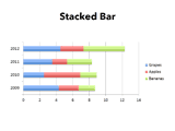
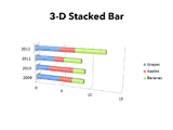
These chart types compare the percentage that each value contributes to a total across categories. A 100% stacked bar in a 3-D chart displays the horizontal rectangles in 3-D format. It does not display the data on third axis.
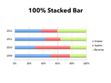
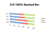
These charts are available in the same clustered, stacked, and 100% stacked chart types that are provided for rectangular bar charts. They show and compare data the same way as other bar chart types, and the only difference is that these chart types display cylinder, cone, and pyramid shapes instead of horizontal rectangles.

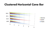
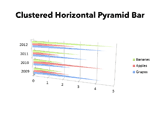
Bar Chart Type in PowerPoint Sample Presentation
Click above to view on SlideShare
Click above to view on YouTube
PowerPoint Chart Types: Bar Charts in PowerPoint (Glossary Page)
You May Also Like: Explore Fonts: Papyrus | Beetroot PowerPoint Templates


Microsoft and the Office logo are trademarks or registered trademarks of Microsoft Corporation in the United States and/or other countries.