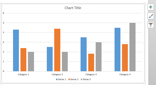
Text used to label the chart axes in a chart is called an Axis Title. All chart types other than Pie and Doughnut have axes, and although Radar charts have an axis, there is no provision to add axis titles for them. In all other chart types such as Column, Line, etc., axis titles are not visible by default as you can see in the chart shown in Figure 1, below.

Figure 1: Axis Titles don't show up by default
You have to make them visible first, and then edit them as required. That's exactly what you are going to learn in this tutorial.
Follow these steps to learn how to add and edit axis titles in PowerPoint 2013 for Windows:
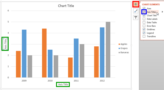
- First insert a chart. Then select the chart and click the Chart Elements button indicated by the Plus sign as shown highlighted in red within Figure 2, below. This action opens the Chart Elements gallery. Within the Chart Elements gallery, make sure that the Axis Titles check-box is selected as shown highlighted in blue within Figure 2. Doing so will enable both the value and category axis titles in your chart, as shown highlighted in green within Figure 2.

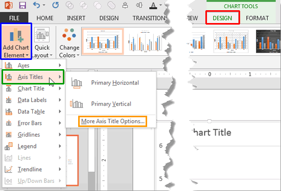
Figure 2: Axis titles enabled - Alternatively, select the chart to activate the Chart Tools tabs on the Ribbon. Select the Chart Tools Design tab as shown highlighted in red within Figure 3, below. Within the Chart Tools Design tab, click the Add Chart Element button, highlighted in blue within Figure 3 to bring up a drop-down gallery that you can see in Figure 3. Within this drop-down gallery, select the Axis Titles option as shown highlighted in green within Figure 3.

Figure 3: Axis Titles sub-gallery Contextual Tabs
- The Chart Tools, Design, and Format are contextual tabs. These tabs are special tabs in the Ribbon that are not visible all the time. They only make an appearance when you are working with a particular slide object which can be edited using special options.
- Doing so opens the Axis Titles sub-gallery (refer to Figure 3 above). Within the Axis Titles sub-gallery, the top two options are used to add axis titles to your chart:
- Primary Horizontal option is to enable the category axis title.
- Primary Vertical option is to enable the value axis title.
- Either way, you end up enabling axis titles. Now, overwrite the default Axis Title boilerplate text with your own chart axis title text.
- You can also format the axis titles as required. To do so, select the axis title and access the Axis Titles sub-gallery as explained in the preceding step. Next, select More Axis Title Options (the last option, highlighted in orange within Figure 3, above).
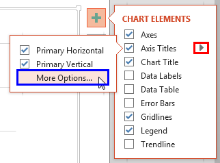
- Alternatively, access the Chart Elements gallery. Within the Chart Elements gallery, hover the cursor over the Axis Titles option to bring up a right-arrow as shown highlighted in red within Figure 4, below. Click this right-arrow to open the Axis Titles sub-gallery. Within the Axis Titles sub-gallery, select More Options as shown highlighted in blue within Figure 4.

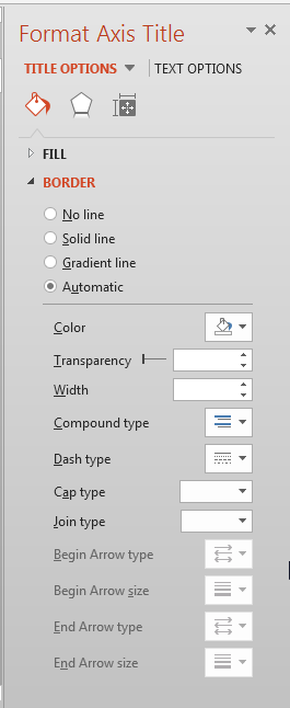
Figure 4: More Options - Either of the above options will access the Format Axis Title Task Pane, as shown in Figure 5, below.

Figure 5: Format Axis Title Task Pane - Options within this Format Axis Title Task Pane work in the same way as they do for Chart Data Label. In our Format Data Label Options for Charts in PowerPoint 2013 tutorial you can get more info about these options. Read Step 2 onwards within that tutorial.
- Save your presentation often.
