After you add text within a shape
in PowerPoint 2011 for Mac, you can do basic edits like adding,
deleting, or replacing existing text but if you want more control over how your text has been placed within the shape or
a text box, you'll need to access text editing options within the Format Text dialog box:
- Select your shape
that already contains some text;
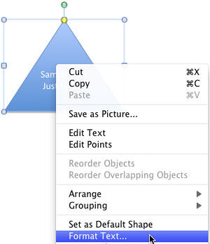
this technique also works with text boxes. Right-click to bring up the contextual menu and choose the
Format Text option, as shown in Figure 1.
-

Figure 1: Format Text option selected
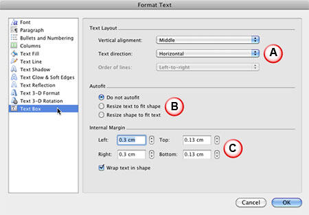
- This opens the Format Text dialog box. Make sure that the Text Box option
within the sidebar is selected as shown in Figure 2. This brings up the text alignment options that we
discuss next.
-

Figure 2: Text alignment options within the Format Text dialog box
- The text alignment options are divided into three sections, as marked in Figure 2,
above:
A. Text Layout
- Comprises options to change text alignment and direction.
Vertical alignment
- Click to access a drop-down menu (see Figure 3). Choose any of the options to
change the alignment of the selected text.
-

Figure 3: Vertical alignment options
- Whichever option you select, it will change the alignment of text within the selected shape.
Figure 4 shows how the alignment of text within the same shape is influenced by using the
Top, Middle, and Bottom alignment choices.
-

Figure 4: Text alignment changed to Top, Middle, and Bottom
Tip: Do note that shapes by default have center aligned text. So, choosing the
Top Centered, Middle Centered, or Bottom Centered options makes no
difference. However within text boxes, the Top, Center, and Bottom
options provide text that is left aligned, so the Centered options provide an extra set of options.
Text direction
- Clicking this option brings up a drop-down list with options that enable you to change the
direction of text within the selected shape or text box (see Figure 5).
-

Figure 5: Text direction options
- Choose any of the options to change the direction of the text within the shape to
Horizontal (default) to Rotate to 90° Counterclockwise,
Rotate to 90° Clockwise, or Stacked, (last three options as shown respectively from
left to right in Figure 6).
-

Figure 6: Text direction changed 90° Counterclockwise, 90° Clockwise, and Stacked
Note: If you choose Rotate to 90° Counterclockwise or Rotate to 90°
Clockwise, the Vertical alignment options (as shown in Figure 3, earlier on this
page) change to Horizontal alignment options.
- You can change the Order of lines to either Right-to-left,
or Left-to-right as shown in Figure 7 if you chose the Stacked option
for the direction of the text.
-

Figure 7: Options to change the order of the lines
B. Autofit
- This section has three radio buttons (refer to Figure 2, earlier on this page):
Do not Autofit
- Does not fit the text automatically within the shape, and this is the default option. If you
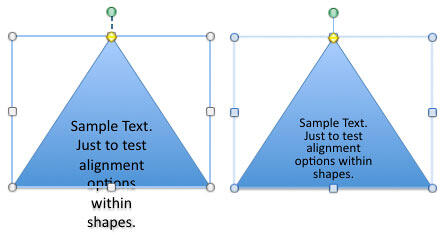
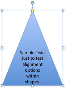
want your text to fit within the shape, choose one of the other two options. In Figure 8, the triangle
shape on the left uses the Do not Autofit option, and the triangle on the right uses the
Resize text to fit shape option, discussed next.
-

Figure 8: Shapes with Do not Autofit option and Resize text to fit shape option
Resize text to fit shape
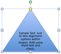
- Fits all the text by reducing the text size to keep the text fitted inside the shape. In
Figure 9 you can see that more text has been added to the same triangle shape that you saw towards
right in Figure 8.
-

Figure 9: Text size reduced when more text was added
Resize shape to fit text
- Retains the text size but increases the container shape's size so that the text remains
fitted inside the shape, as shown in Figure 10.
-

Figure 10: Shape's size increased to keep the text fitted within the shape
C. Internal Margin
- Provides options to tweak the space around the text within the shape (refer to
Figure 2, earlier on this page):
- Change the Left, Right, Top, and
Bottom margin values individually to set the margin for the text within your selected shape.
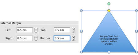
In Figure 11, towards left you can see all margin values increased for the shape that you saw
towards right in Figure 8 earlier. The resultant flow of the text can be seen in the shape
towards the right of Figure 11.
-

Figure 11: Internal margin values changed
Wrap text in shape
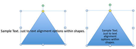
- This check-box, when selected, wraps the text to flow within the shape. As you can see
towards the left in Figure 12, the shape with the text that is not wrapped. You can see the
same shape with text wrapped towards the right of Figure 12.
-

Figure 12: Text within the shape when not wrapped and same shape with text wrapped
Columns
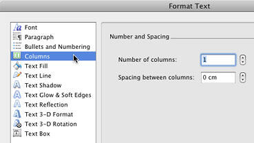
- This option is used to arrange the text within a shape into columns. Select the
Columns option in the sidebar of the Format Text dialog box as shown in
Figure 13.
-

Figure 13: Columns option within the Format Text dialog box
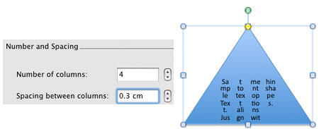
- Here, you can divide text within the shape into columns and even control the spacing
(gutters) between the columns. Figure 14 shows the text divided into 4 columns with spacing
of 0.3 inches in between.
-

Figure 14: Text divided into columns with spacing
