After adding text within a shape (or
a text box) in PowerPoint 2010 for Windows, you can do
basic edits like adding, deleting or replacing existing text but if you want more control over how your text is placed
within the shape or a text box, you'll need to access these options within the Format Shape dialog box.
Follow these steps to learn more in PowerPoint 2010 for
Windows:
- Select your shape that
already contains some text. Right
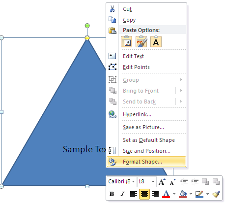
click to bring up the context menu shown in Figure 1, and choose the Format Shape
option.
-

Figure 1: Format Shape option
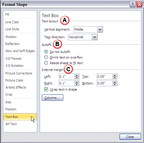
- This opens the Format Shape dialog box, as shown in Figure 2. Click the
Text Box tab in the left pane to explore the text box format options on the right of the dialog box.
-

Figure 2: Format Shape dialog box
- The options within the Format Shape dialog box are explained below, as marked in
Figure 2 above:
A. Text layout
- Comprises options to change text alignment and direction.
Vertical alignment
- Click to get a drop down menu (see Figure 3). Choose to change the alignment
of the selected text.
-

Figure 3: Alignment options
- Whichever option you'll choose, it will change the alignment of text within the selected
shape. Figure 4 shows how the alignment of text within the same shape is influenced using the
Top, Middle, and Bottom alignment choices.
-

Figure 4: Text alignment changed to Top, Middle, and Bottom
Tip: Do note that shapes by default have center aligned text. So, choosing the
Top Centered, Middle Centered, or Bottom Centered options makes
no difference. However within text boxes, the Top, Center, and
Bottom options provide text that is left aligned, so the Centered options provide
an extra set of options.
Text direction
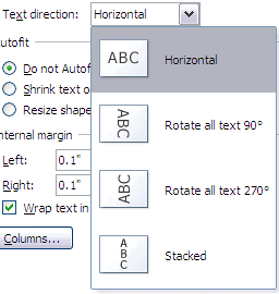
- Clicking this option brings up a drop down list that enables you to change the direction of
text in the selected shape (see Figure 5).
-

Figure 5: Text direction options
- Choose any of the options to change the direction of the text within the shape to
Rotated 90°, Rotated 270°, or Stacked, as shown in
Figure 6.
- You can change the line order to either Right-to-left, or
Left-to-right if you chose the Stacked option.
-

Figure 6: Changed direction of the text within the shape to 90°, 270°, and Stacked
Note: If you choose Rotate all text 90° or 270°, the
Vertical alignment options (as shown in Figure 3, earlier on this page) change
to Horizontal alignment options.
B. Autofit
- This section has three radio buttons:
Do not Autofit
- Does not fit the text automatically within the shape, and this is the default option. If you
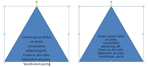
want your text to fit within the shape, choose one of the other two options. In Figure 7, the triangle
on the left uses the Do not Autofit option, and the triangle on the right uses the Shrink text
on overflow option, discussed next.
-

Figure 7: Text within the shape with Do not Autofit option and Shrink text on overflow option
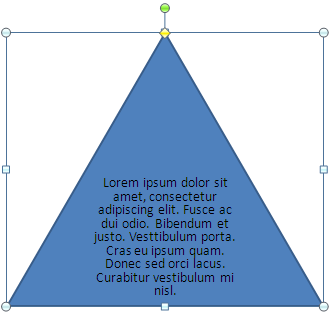
Shrink text on overflow
- Fits all the text by reducing the text size to keep the text fitted inside the shape (see
Figure 8).
-

Figure 8: Text size reduced when more text was added
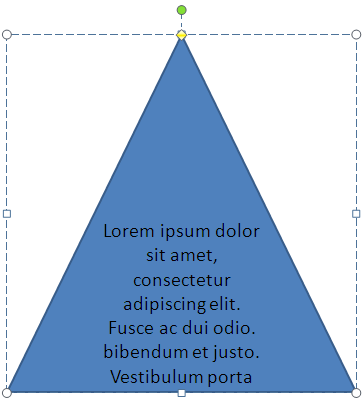
Resize shape to fit text
- Retains the text size but increases the shape's size so that the text remains fitted inside
the shape, as shown in Figure 9.
-

Figure 9: Increases the shape size to keep the text fitted within the shape
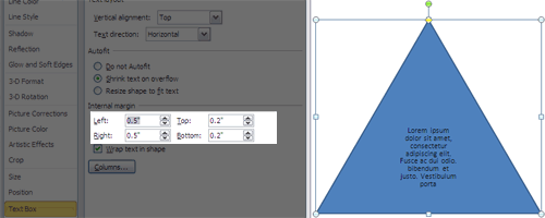
C. Internal margin
- Provides options to tweak the space around the text within the shape.
- Change the Left, Right, Top, and
Bottom margin values individually to set the margin for text in your selected shape.
Figure 10 shows all margins increased. The flow of the text can be seen in the resultant shape
towards the right of Figure 10.
-

Figure 10: Changes in the internal margin values
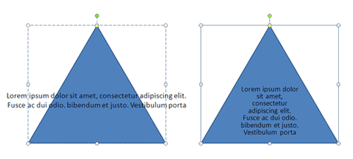
Wrap text in shape
- This check box, when enabled wraps text to flow within the shape. Figure 11
shows the text that is not wrapped within the shape towards the left, and the same shape with text wrapped within the
shape towards the right.
-

Figure 11: Text within the shape when not wrapped and same shape with text wrapped
Column
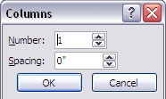
- If you choose this option, it opens the Columns dialog box, as shown in
Figure 12.
-

Figure 12: Columns dialog box
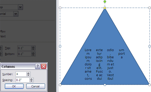
- You can divide text within the shape into columns and even provide spacing (gutters) between the
columns. Figure 13 shows the text is divided into 4 columns with spacing of 0.2 inches in between.
-

Figure 13: Text divided into columns with spacing
