Learn to adjust the gap width between chart categories in PowerPoint 2013 for Windows. You may want to reduce or increase the gap width if you have too many or too few chart categories.
Author: Geetesh Bajaj
Product/Version: PowerPoint 2013 for Windows
OS: Microsoft Windows 7 and higher
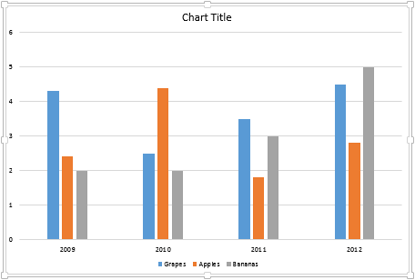
The gap width within a chart is the space between two categories, as indicated by red arrows within the column chart you see in Figure 1, below. We created the chart you see here within PowerPoint 2013 for Windows. This is a clustered column chart type, and the gap width here is set to 219% of the width of individual data series (columns). We now want to alter this gap width.
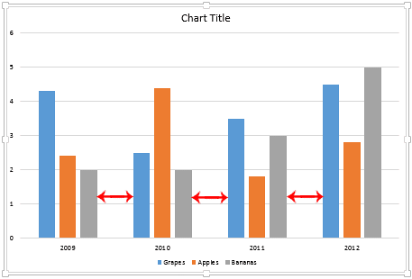
Figure 1: Clustered Column chart with default gap width
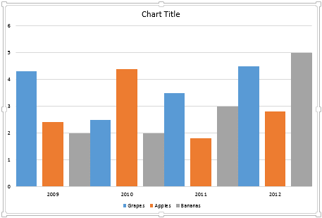
The gap width is automatically calculated by default based on the chart data and the plot area space. Thus, if you have many data categories represented by thin columns, this gap width will be very narrow. The opposite is also true, and you'll see wider gap widths when there are fewer data series. Yet, you can manually make some changes in the gap width as required by quickly increasing or decreasing this width.
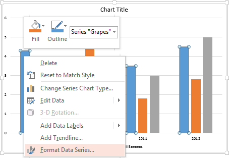
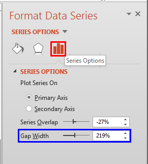
Follow these steps to explore changing the gap width between categories in PowerPoint 2013 for Windows:
See Also:
Advanced Chart Techniques: Adjust the Chart Gap Width (Glossary Page)
Adjust the Chart Gap Width in PowerPoint 2011 for Mac
You May Also Like: 5 Ideas to Help You Remember Your Speech | Cashew Nuts PowerPoint Templates


Microsoft and the Office logo are trademarks or registered trademarks of Microsoft Corporation in the United States and/or other countries.