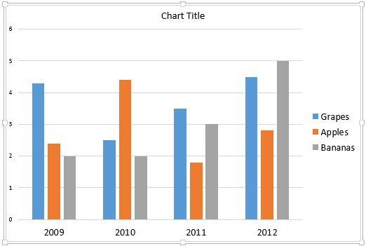
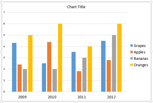
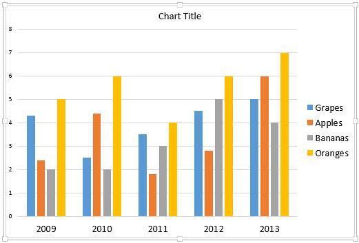
When you add a new chart in PowerPoint 2013 for Windows, you will see that it has its roots in Excel, and all chart data is also stored within an Excel sheet. When you edit chart data within Excel, the process may not be limited just to changing the values. You many also need to add a new Series or Category. If we use a column chart as an example, Series within your Excel sheet show up as the columns. Categories on the other hand are essentially a set of series. In the sample chart shown within Figure 1, the Series are Grapes, Apples, and Bananas, and, the Categories are the years 2009 through 2012.

Figure 1: Chart selected on the slide
We will continue exploring our sample chart, as shown in Figure 1, above. Let us imagine that we want to add a whole new series for Oranges. Let's now learn how we can add and delete Series and Categories:
- Open your presentation, navigate to slide containing your chart and select the chart as shown previously in Figure 1. If you don't have an existing chart, insert a new chart in your slide.
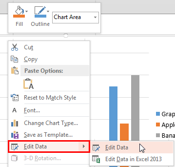
- Right-click the selected chart. From the context menu, choose the Edit Data option (highlighted in red within Figure 2) to open a sub-menu. In this sub-menu, select the Edit Data option, as shown in Figure 2.

Figure 2: Edit Data option within the sub-menu
This action opens an instance of the Excel sheet containing the chart data, as shown in Figure 3, below. Now, follow these guidelines to add or delete Series or Categories, as required:
Add New Series or Category in the End
Follow these steps to add a new Series or Category in the end:
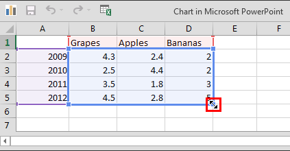
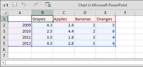
- Place your cursor on the lower-right corner of the data table so that it turns into a pointer, as shown highlighted in red within Figure 3.

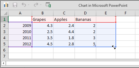
Figure 3: Cursor changed - Now, click and drag this pointer (highlighted in red within Figure 3, above) rightwards as shown in Figure 4.

Figure 4: Drag the pointer rightwards to add a new Series - Type in the values you need. You can see in Figure 5, that we included the name of the new fruit (Oranges) in the Heading row and then entered some values below.

Figure 5: New Series added and edited - Close the instance of the Excel sheet. You'll see that the new Oranges Series has been added to your chart, as shown in Figure 6, below (compare with the chart in Figure 1, shown earlier on this page).

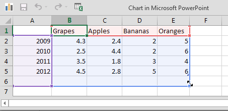
Figure 6: Chart reflecting the changes after added with new Series - Similarly, to add a new Category in the end, bring up the corner pointer (highlighted in red within Figure 3, earlier on this page) and click and drag it downwards as shown in Figure 7, below.

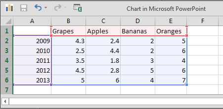
Figure 7: Drag the pointer downwards to add a new Category - Type in the values required. As you can see in Figure 8, below, we typed the year 2013 in the Heading column and then entered some values below.

Figure 8: New Category added and edited - Close the instance of the Excel sheet containing the chart data. You'll see that a new Category has been added to your chart, as shown in Figure 9, below (compare with the charts in Figures 1 and 9).

Figure 9: Chart reflecting the changes after added with new Category
Add New Series or Category in Between
Follow these steps to add a new Series or Category in between:
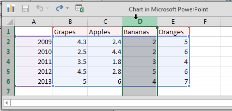
- To add a new Series somewhere in between, select the column representing the subsequent Series as shown in Figure 10, and right-click.

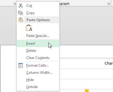
Figure 10: Insert a new Series in between - The minute you right-click, a contextual menu appears as shown in Figure 11. Within this contextual menu, select the Insert option (refer to Figure 11 again).

Figure 11: Insert option - This inserts a new blank column (Series). Here just add new data as required.
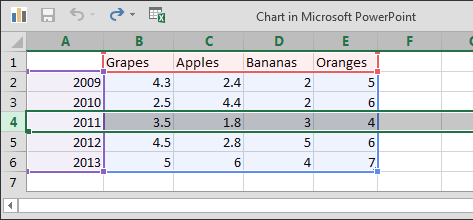
- Similarly, to add a new Category somewhere in between, select the row representing the subsequent Category as shown in Figure 12, and right-click the Row Header.

Figure 12: Insert a new Category in between - The minute you right-click, the same contextual menu appears that you saw in Figure 11, earlier on this page. From this contextual menu, select the Insert option (refer to Figure 11 again).
- This inserts a new blank row (Category). Here just add new data as required.
Delete Series and Category
Follow these steps to delete a Series or Category:
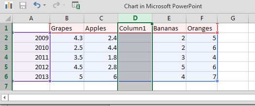
- To delete a particular Series select the column representing the subsequent Series, as shown in Figure 13 and right-click.

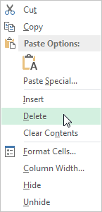
Figure 13: Delete a Series - The minute you right-click, a contextual menu appears as shown in Figure 14. From this contextual menu, select the Delete option (refer to Figure 14 again).

Figure 14: Delete a Series - This deletes the selected column (Series).
Tip: You can also delete a Series within PowerPoint, just click once (don't double-click) on the Series to be deleted within the chart, and press the Delete key on your keyboard. Note that the series just get deleted from the chart you can still see the values within the Chart Data.
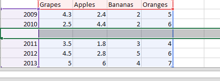
- To delete a particular Category, select the corresponding row as shown in Figure 15, and right-click.

Figure 15: Delete a Category - The minute you right-click, the same contextual menu appears that you saw in Figure 14, earlier on this page. From this contextual menu, select the Insert option (refer to Figure 14 again).
- This deletes the selected row (category).
- When you are done, close the instance of the Excel sheet containing the chart data. The changes will automatically reflect within the chart on your PowerPoint slide. Save your presentation often!
